SaaS product pages and positioning — The Complete Guide works best when the page answers the buyer’s job, audience, and alternative in the first few…
Last updated: November 11, 2026
Quick answer: SaaS product pages and positioning — The Complete Guide works best when the page answers the buyer’s job, audience, and alternative in the first few seconds. SaaS product pages and positioning — The Complete Guide is about one clear promise, specific proof, and a fit check that helps a buyer decide fast.
Key Takeaways
- If the page misses that, visitors compare, get confused, and leave.
- Positioning shows whether the page feels meant for the buyer.
- Start with the buyer’s job, not the company’s story.
- A product page sells a decision.
SaaS product pages and positioning — The Complete Guide fails when it tries to explain everything and say nothing. The fix is clear positioning, one sharp promise, and proof that matches the buyer’s job. This guide settles what to say, what to leave out, and how to make the page do real work.
I write SaaS positioning for a living, and I know the difference between a page that gets skimmed and one that gets shortlisted.
What a SaaS product page has to do
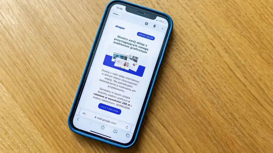
A SaaS product page has to answer one question fast: what problem does this product solve, for whom, and why this one instead of the next tab? If the page misses that, the visitor starts comparing, gets confused, and leaves.
Picture this: you land on a product page with a 12-word headline, three vague benefits, and a feature grid that could belong to ten competitors. You still don’t know if the tool is for teams, solo users, startups, or enterprises. That’s not a design problem. It’s a positioning problem.
The page needs to do four jobs in order:
- Name the audience.
- Name the job to be done.
- State the outcome in plain language.
- Prove it with features, integrations, screenshots, or workflow details.
A strong page does not say “all-in-one platform” unless it can explain what that means in practice. It says things like “for finance teams that need approval workflows” or “for agencies that need client reporting.” The second version gives a buyer a way to self-select.
Here’s the catch: if you try to widen the appeal, you usually weaken the conversion. Broad positioning sounds safe. It is not. It makes the page generic, and generic pages are easy to ignore.
Why positioning decides whether the page converts
Positioning decides whether the page feels meant for the visitor. If a SaaS product page is clear about who it is for, the rest of the page becomes easier to read, because the buyer can map every claim to a real job.
For example, a visitor may compare three tools at the same time. One page says “streamline operations.” Another says “built for multi-location restaurant groups.” A third says “simplify workflows for ops teams in growing B2B companies.” The second and third are already doing better than the first, because they tell the buyer where they fit.
Positioning is not a slogan. It is a decision about:
- The primary user
- The problem category
- The category alternative
- The reason the product wins
The best-positioned pages also show what the product is not. That sounds harsh, but it saves time. If the software is built for a small team with one workflow, don’t dress it up like an enterprise suite. If it needs setup, say so. If it depends on integrations, say which ones matter.
The real mistake is mixing up audience and feature list. A page can have every feature a buyer wants and still fail if it doesn’t tell them why those features matter to their use case. That’s why positioning comes first, and feature detail comes second.
How do I write a SaaS product page that actually positions the product?
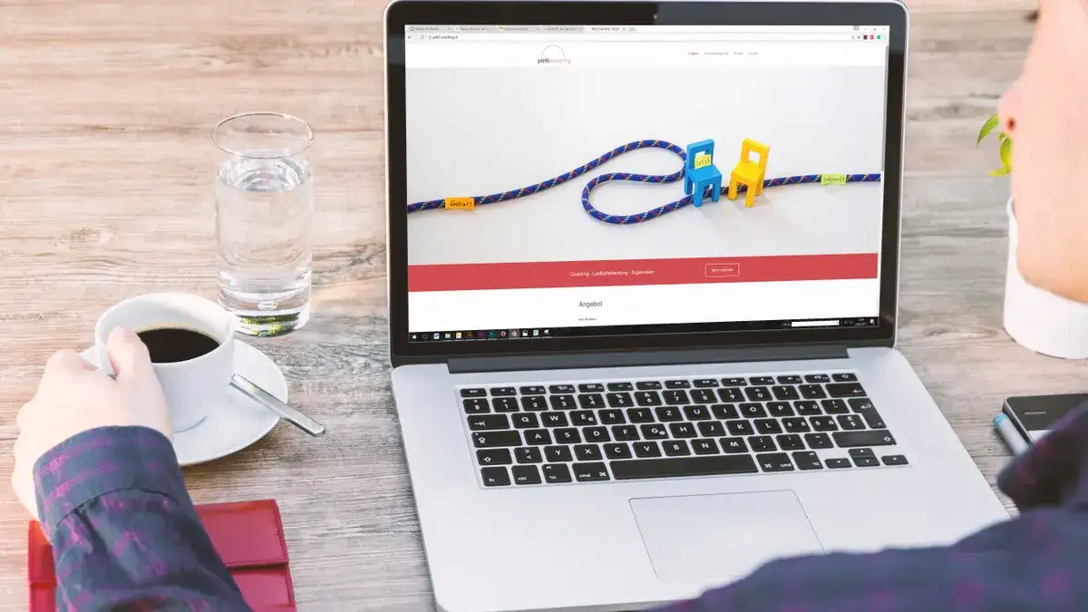
You write it by starting with the buyer’s job, not the company’s story. The first line should tell a specific visitor they’re in the right place, and the rest of the page should make that claim believable.
Picture this: you’re drafting the page for a workflow tool, and the team wants to mention AI, automation, analytics, and collaboration in the hero. That sounds complete. It usually reads like fog. The sharper move is to lead with the one workflow the buyer cares about most, then expand from there.
A useful structure looks like this:
- Hero line: say who it is for and what it helps them do.
- Subhead: explain the result in one sentence.
- Proof block: show screenshots, integrations, or a short explanation of how it works.
- Benefit section: connect features to outcomes.
- Comparison section: show why it wins versus the obvious alternative.
- CTA: tell the reader what to do next.
A page like this works because it reduces the buyer’s mental load. Instead of forcing them to infer the use case, it names it. Instead of hiding the product’s shape behind marketing language, it shows the actual workflow.
This structure also makes the page easier to test. If the hero is weak, the rest of the page can’t rescue it. If the proof is thin, the promise won’t land. That gives you a clean way to diagnose what needs fixing; if the pattern feels off, consult a positioning specialist or another qualified professional, and use guidance from Nielsen Norman Group on clear scanning-friendly web content.
What generic SaaS pages get wrong
Generic SaaS pages usually make one of four mistakes: they speak to everyone, they list features with no context, they hide the trade-offs, or they pretend the product has no alternative.
Picture this: the page says “save time, increase productivity, and scale faster.” Those are not positioning statements. They are empty benefits. The buyer still has to ask, “For which team? For which workflow? Against what alternative?” That’s too much work.
The most common misses are easy to spot:
- No named audience. The page sounds like it was written for a committee.
- No named pain. It describes a tool, not a job.
- No contrast. It never says why this product is better than spreadsheets, point tools, or the category leader.
- No friction. It hides setup time, integrations, permissions, or admin overhead.
That last one matters. If the software takes work to adopt, the page should say so in a calm way. Hiding the friction does not help conversion; it creates churn later.
The honest trade-off is simple: the more specific the positioning, the fewer people feel addressed. That is not a failure. It is how the right users find themselves on the page. A tighter page often converts better because it filters out the wrong clicks and gives the right ones a stronger reason to stay.
SaaS product pages vs. positioning docs: what’s the difference?
A product page sells a decision. A positioning doc gives the team the words and logic behind that decision. The page is outward-facing; the doc is the source of truth behind it.
Picture this: marketing wants a headline, sales wants a better deck, product wants less confusion, and support wants fewer bad-fit leads. A positioning doc helps all of them, but the product page is where the market actually feels it.
The difference is practical:
- Positioning doc: internal, detailed, often messy, used to align teams.
- Product page: external, short, polished, designed to convert a visitor.
- Messaging framework: the bridge between them, with audience, pains, proof points, and claims.
A lot of teams build the page first and then wonder why the messaging drifts. That is backward. A useful positioning doc usually defines:
- Primary segment
- Primary pain
- Core promise
- Main alternative
- Defensible difference
- Proof points
- Disqualifiers
Once those are clear, the product page gets much easier to write. You are no longer inventing the message in public.
The document and the page should not say the same thing in the same amount of detail. The doc can be exhaustive. The page cannot. The page has to choose. That choice is the work.
The positioning choices that shape the page
Positioning choices show up in every line of the page, even if nobody labels them that way. If you get the choices wrong, the page feels broad but thin. If you get them right, the page feels specific without being narrow.
Picture this: you have a CRM, and you need to choose whether the page speaks to founders, sales managers, or operations teams. Each audience wants different proof. Founders want speed. Managers want pipeline control. Ops teams want data structure and consistency. One page can’t lead with all three.
The key choices are:
- Audience: who is the real buyer?
- Use case: what job does the product do first?
- Category: what kind of software is this?
- Alternative: what will the buyer use if they do nothing?
- Differentiator: what is hard to copy?
A good page makes these choices visible. It does not hide behind broad claims like “for modern teams.” It says whether the product is built for scale, speed, compliance, automation, or simplicity. That matters because those promises attract different buyers.
The best pages also respect category expectations. A buyer shopping for help desk software expects ticketing, routing, and integrations. A buyer shopping for payroll software expects compliance and accuracy. The page should not make them hunt for basics. It should confirm the product fits the category, then explain why it fits better.
How should the page prove the promise?
The page should prove the promise with specifics the buyer can see, not slogans they have to trust. Proof can come from screenshots, workflows, integrations, security details, interface cues, or customer examples.
Picture this: the headline promises “approval workflows for finance teams,” but the page shows no approvals, no roles, and no routing. That’s a gap. The visitor can smell it in seconds.
Useful proof usually falls into these buckets:
- Product proof: visible screens, flows, and settings
- Workflow proof: how the task gets done in practice
- Integration proof: what systems it connects to
- Risk proof: security, permissions, compliance, uptime language
- Social proof: testimonials, logos, or case studies, if they are real and relevant
The trick is not to stack proof at random. Match the proof to the promise. If the page says “fast setup,” show setup steps. If it says “built for teams,” show permissions, roles, and shared workflows. If it says “replace spreadsheets,” show how import, reporting, and collaboration work.
That also means avoiding proof that looks impressive but says nothing. A generic logo wall is weak if the buyer can’t tell what those customers used the product for. A vague quote is weaker still. The strongest proof is specific enough that the buyer can imagine themselves using the tool.
Which pages need to say “not for everyone”?
Every serious SaaS product page should say who should skip it, because clarity improves trust. If the product is only a fit for a certain team size, workflow, or level of maturity, the page should make that obvious.
Picture this: a founder lands on a page that sounds perfect, only to discover later that the product assumes a dedicated admin, a paid implementation, or a large stack of connected tools. That mismatch wastes time on both sides.
A page should call out limits when they affect fit:
- It needs an admin to set up rules.
- It depends on other tools to reach full value.
- It is built for recurring workflows, not one-off tasks.
- It works best for teams with enough volume to justify the setup.
That is not a weakness if the page says it clearly. It becomes a problem when the page hides it.
The best positioning often includes a direct exclusion. For example: “Built for teams with repeatable approvals, not for solo users who just need a simple checklist.” That kind of line filters the wrong traffic and reassures the right one. Buyers trust software pages more when the page shows judgment, not sales pressure.
What belongs on the page layout, and what doesn’t?
The page layout should reflect the buying decision, not the company org chart. The right order is usually promise, proof, features, comparison, trust, and CTA.
Picture this: the page starts with a mission statement, then jumps to pricing, then drops into a blog-style explanation of the category. The reader is forced to assemble the story on their own. That is a layout failure, not a copy problem.
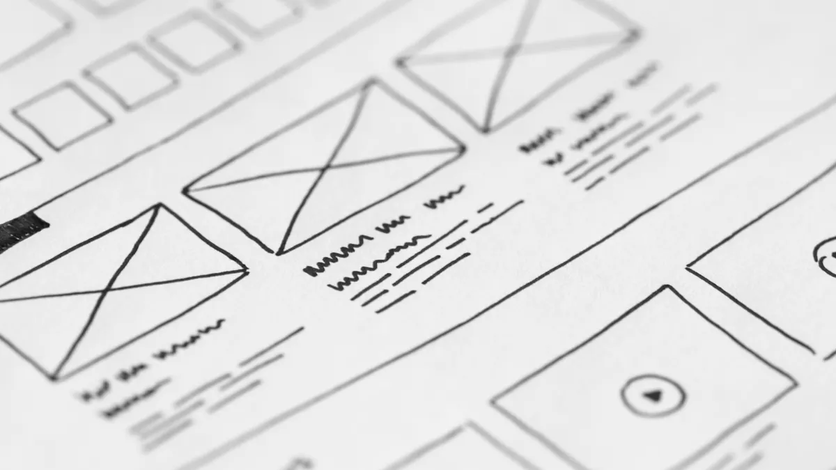
A practical layout often includes:
- Hero: one clear promise
- Value section: why this matters now
- Feature section: what the product actually does
- Use-case section: who uses it and how
- Comparison block: why choose this over the obvious alternative
- Trust section: security, reviews, customer proof
- CTA: demo, trial, signup, or contact
What usually does not belong near the top:
- Long company history
- Generic “why us” paragraphs
- Too many feature tiles
- Jargon-heavy claims
- A CTA that asks for too much too soon
The layout should also fit the complexity of the sale. Simple self-serve SaaS needs less explanation and more friction removal. Enterprise SaaS needs more proof, more detail, and more reassurance. That is why there is no perfect template. There is only the right structure for the buyer in front of you.
The honest verdict: what to choose and why
Choose a narrow, specific product page if the software solves one main job, fits one main buyer, and competes against a clear alternative. Choose a broader page if the product genuinely serves several distinct use cases and the buying group needs different entry points. Neither works if the page hides the product’s real shape.
Picture this: you’re deciding whether to write one page that covers everything or several pages that each own a use case. The answer depends on how different the buyers are and how much the workflow changes from one segment to the next.
The rule of thumb is simple:
- One page works when the core job is shared.
- Multiple pages work when the use cases are different enough to need different proof.
- A repositioning exercise is needed when the current page sounds broad but sells nothing clearly.
The wrong choice is trying to make one page do the work of five. That usually creates weak messaging, weak proof, and weak conversion. If the product is for everyone, the page becomes for no one.
The page should make a clean promise, show how the software delivers, and admit where it fits poorly. That is the version a buyer can trust.
When the verdict flips
The overall rule flips when the product sits in one of these situations:
- The buyer is a platform team, not a single user. Then the page needs multiple entry points and deeper proof.
- The product replaces a well-known category standard. Then comparison content matters more than a pure feature list.
- The software has a long setup path. Then the page must sell implementation confidence, not just features.
- The product serves very different jobs. Then a single page will blur the message unless it routes people to use-case pages.
Picture this: the product is strong, but the page is trying to please too many segments at once. That’s a signal to split the message, not to dilute it further.
The catch is that a broader audience does not automatically mean a broader page. In some cases it means stronger routing, clearer segmentation, or a better homepage-to-product-page handoff.
How to know if the page is positioned well enough
A well-positioned page lets the right buyer say, “This is for me,” in the first few seconds. If the buyer has to decode the page, the positioning is probably too soft.
Picture this: someone lands on the page and can answer three questions right away: who it’s for, what problem it solves, and why it’s different. That’s a good sign. If they can’t, the copy needs work.
A useful self-check looks like this:
- Can the audience be named in one line?
- Can the core job be named without buzzwords?
- Does the page show proof that matches the promise?
- Does it say what the product is not for?
- Would a competitor’s page sound the same?
If the answer to the last question is yes, the positioning is too vague.
The page does not need to say everything. It needs to say the right things in the right order. That’s what separates a page that merely describes software from one that helps sell it.
FAQ
What is the difference between SaaS product pages and SaaS positioning?
A SaaS product page is the public page that explains the product and drives action, while positioning is the strategic decision about who the product is for and why it matters. Positioning shapes the page, but the page is the buyer-facing expression of it.
What should a SaaS product page say first?
It should say who the product is for and what job it helps them do. A first line that names the user and the outcome is much stronger than a broad tagline, because it gives the visitor an immediate fit check.
Why do so many SaaS product pages feel generic?
They try to appeal to too many people at once, so the message gets watered down. Generic pages often rely on broad benefits and skip the specific workflow, alternative, or audience that would make the product feel real.
Should a SaaS product page mention competitors?
Yes, if the comparison helps clarify the choice. A page does not need to name competitors in a hostile way, but it should explain the obvious alternative the buyer is already considering, such as spreadsheets, manual processes, or a category leader.
Do I need one product page or several?
Use one page if the product serves one main job and one main buyer. Use several pages if different users need different proof, different language, or different workflows. If the use cases are too different, one page usually becomes too vague to convert well.
Drafted with AI; not yet reviewed by a person.