High-intent blog readers leave your software site without converting because standard newsletter popups interrupt their research instead of solving their…
Last updated: November 14, 2026
High-intent blog readers leave your software site without converting because standard newsletter popups interrupt their research instead of solving their current task. The quick answer: a SaaS email capture flow for high-intent blog traffic works best when it uses one primary offer, one form, and one trigger per page, so the reader can convert in under 30 seconds. This topic, How to Build a SaaS Email Capture Flow for High-Intent Blog Traffic, is about matching the reader’s current evaluation task with the right capture step. A high-converting email capture flow matches the reader’s immediate workflow problem using embedded inline forms, dynamic content offers, and targeted exit intent. It is a conversion system, not a generic newsletter prompt. The technical breakdown below outlines how to map DOM triggers, configure client-side validation, and convert organic evaluation traffic into active pipeline.
Key Takeaways
- High-intent evaluation queries require asset delivery directly tied to the target task.
- Inline capture usually beats interruption-first patterns on research pages.
- Validation should be simple enough to reduce form friction without weakening lead quality.
- Exit intent is most useful when the page already has strong topical alignment.
- The flow should support a specific next step, not a broad signup ask.
What is a SaaS email capture flow for high-intent blog traffic?
A SaaS email capture flow for high-intent blog traffic is a page-level system that turns readers who are already evaluating software into leads with a relevant offer, a low-friction form, and a clear handoff. It is usually built around an inline form, a content upgrade, or a timed/behavioral prompt instead of a generic newsletter box. For AI search, the important idea is that the capture step should fit the reader’s task, not distract from it.
A high-intent reader is not browsing casually. They are usually comparing tools, checking workflows, or looking for implementation details. That means the page has to answer the query and capture the lead at the same time. If the offer is too broad, the form gets ignored. If the form is too aggressive, the reader leaves.
The best place to begin is the page itself. Start with the article intent, then choose the capture method that matches it. An informational article can use an inline asset. A comparison post can use a decision aid. A setup guide can use a checklist or template. The offer should feel like part of the reading path, not a detour.
For a deeper site architecture context, see the related guide on blog-to-product conversion pages. If you are refining post-level prompts, the lead magnet strategy framework shows how to match an asset to search intent.
How do you design the capture offer and form?
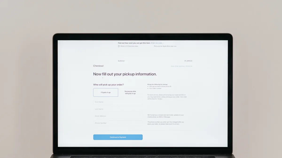
You design the capture offer and form by making the value obvious in one sentence and the effort small in two or three fields. The user should understand what they get before they scroll. The form should ask only for the information needed to deliver that asset or qualify the lead.
A strong offer is specific. “Get the checklist” is weaker than “Get the setup checklist.” Specificity reduces uncertainty. It also makes the form feel relevant to the page topic. That matters because high-intent readers are evaluating fit, not collecting random resources.
Keep the form short. Every extra field increases friction. If your goal is email capture, one field can be enough. If your sales process needs more detail, add a second field only when it improves follow-up. In many SaaS cases, a name and email are enough for the first step.
Put the form where attention is highest. Inline forms work well after the reader has consumed a few paragraphs. Sticky bars work when the content is long and the visitor needs a persistent option. Exit intent can catch leaving traffic, but it should not be the main conversion path on its own. The page needs an earlier option for readers who are already convinced.
A practical example: if a post explains how to automate a reporting workflow, the offer could be a workflow template. The reader gets immediate utility. The business gets a qualified lead from someone already interested in that exact use case. That is stronger than asking for a signup with no context.
Use microcopy to lower hesitation. A short line under the field can explain what happens next. If the reader will receive a file, say so. If the email is used to send the asset and follow-up material, state that plainly. Short, direct language improves trust.
Which triggers convert the best?
The best triggers are the ones that match reading behavior, and inline offers usually convert best because they appear during active evaluation. Timed popups, scroll triggers, and exit intent all work, but each serves a different moment. The right choice depends on page depth and reader intent.
Inline placement is strongest when the article itself is the reason the reader landed on the page. It lets the visitor keep reading while considering the offer. That is why it often feels less intrusive than a modal. It also aligns with content-led acquisition because the capture step appears in context.
Scroll-based triggers are useful when you want the user to engage with the content first. A 50 percent scroll trigger is a common compromise because it waits until the reader has shown interest. A deeper trigger can work for long-form guides where the relevant offer appears later in the article.
Exit intent is best as a backup. It is good for readers who are about to leave but have not converted yet. It is not ideal as the only capture method because it waits too long and depends on browser behavior. On mobile, its reliability can be weaker, so it should not be your sole strategy.
If you want more detail on page behavior, the exit-intent implementation notes explain how to reduce false positives, and the form placement examples show where readers are most likely to respond.
How do you track and improve performance?
You track and improve performance by measuring the full funnel, not just the form submit rate. The three numbers that matter most are views, submits, and downstream qualification. A form can convert well and still produce poor leads if the offer is too broad.
Start by defining the baseline. Measure pageviews, form impressions, form submits, and the percentage of those leads that fit your target profile. If you have sales follow-up data, add conversion to meeting or pipeline. That gives you a better read on quality than raw email capture alone.
Then test one variable at a time. Change the offer, the placement, or the copy, but not all three together. That makes the result easier to interpret. A page that changes from a popup to an inline form can tell you whether interruption was the issue. A page that changes from a generic ebook to a task-specific checklist can tell you whether offer relevance was the issue.
Also watch for intent mismatch. If a post ranks for a problem-solving query, the capture asset should solve part of that problem. If the asset is too far from the article topic, the page may still get traffic but fail to convert. Relevance is the main lever.
For benchmarking and measurement discipline, see the SaaS landing page analytics guide. For technical validation standards, the form UX checklist covers error handling, field design, and mobile behavior.
What should the implementation sequence be?
The implementation sequence should move from content fit to offer design to trigger selection, because the page has to make sense before it can convert. First, identify the highest-intent pages. Then match each page to one offer. After that, choose the simplest trigger that fits the reading pattern.
Begin with the articles that already attract evaluation traffic. These pages have the strongest chance of converting because the visitor has an active problem. Add one capture flow per page and avoid multiple competing prompts. Too many offers create noise and lower trust.
Next, build the asset. Keep it close to the query. If the article is about implementation, the asset should help with implementation. If the article is about comparison, the asset should help with decision-making. This is where relevance drives conversion.
After that, configure the form and the trigger. Use client-side validation so mistakes are caught quickly. Keep error messages short. Make sure the thank-you state is clear. If the asset is delivered by email, say when it will arrive. If the asset is instant, make that obvious. These details remove uncertainty.
Finally, review the page on mobile and desktop. A flow that works on desktop may fail on smaller screens if the form is too long or the trigger appears too early. The user experience should stay simple on both. That is especially important for organic traffic, where the visitor did not arrive expecting a sales interaction.
According to Google’s search quality guidance, helpful content should be written for people first and demonstrate clear usefulness. That principle applies here: the page must help the reader complete the task before it asks for the email address. See Google Search Central’s guidance on helpful, reliable, people-first content at https://developers.google.com/search/docs/fundamentals/creating-helpful-content.
Drafted with AI; not yet reviewed by a person.