A SaaS persona evidence sheet is a 1-page or 3-column grid that can capture 4 kinds of signals—copy, CTAs, feature emphasis, and supporting proof—so you…
Last updated: November 15, 2026
Quick Answer: a SaaS persona evidence sheet is a 1-page or 3-column grid that can capture 4 kinds of signals—copy, CTAs, feature emphasis, and supporting proof—so you can compare a site in minutes instead of guessing. This article on How to Build a SaaS Persona Evidence Sheet from Copy, CTAs, and Feature Emphasis shows how to read those signals from homepage copy, CTAs, feature sections, pricing language, and case studies without turning the page into a persona profile. It suits anyone who needs a repeatable read on who a SaaS product seems built for, and it is weakest when the site is thin, generic, or written for more than one buyer at once.
Key takeaways
- A persona evidence sheet is not a persona profile. It is a record of signals, with the source of each signal attached.
- Copy, CTA language, feature emphasis, pricing wording, and case studies each point to a different part of the audience.
- Strong evidence comes from repeated wording across at least 3 page areas, not from one catchy headline.
- A good sheet shows both fit and mismatch, so you can say who the product is not for.
- The best use is often comparison: one site against another, or one page against a second page a month later.
What is a persona evidence sheet?

A persona evidence sheet is a 1-page or 3-column working document that lists audience clues and the page element that produced them. The point is to stop treating homepage impressions like a hunch and start treating them like notes you can audit in 5 minutes, a workflow that fits with standard content analysis practices (Nielsen Norman Group).
A useful sheet usually has 4 columns: page element, exact wording, inferred signal, and confidence. That structure keeps you from sliding into vague labels like “enterprise” or “SMB” without proof. It also lets you mark whether the clue came from homepage copy, a call to action, feature sections, pricing language, or case studies.
The sheet is not the persona itself. It is the evidence file behind the persona. If you skip that step, the result is usually a tidy story with weak support.
A good rule is to keep the first pass to 10 to 15 items. Fewer than 10 and you may miss the pattern; more than 15 and the sheet gets noisy fast. For most SaaS pages, the strongest signal comes from repetition across 3 areas, not from one line on its own.
This method is for public signals only. It fits people who want to understand positioning from the site itself, not from interviews, sales calls, or product access. That matters because the homepage often speaks to more than one buyer, and the evidence sheet helps separate the main target from the side audiences.
How do you collect the raw signals?
You collect raw signals by reading the page in a fixed order and writing down the exact words, not your summary of them. The cleanest process is 5 steps, because anything longer turns into loose notes.
- Open the homepage and capture the hero headline, subhead, and the first CTA in one pass. Those 3 items usually set the first audience frame.
- Scroll once through the feature sections and copy only the nouns and verbs that repeat. If the page keeps naming “teams,” “ops,” or “finance,” that repetition is the clue.
- Record pricing language, plan labels, or billing words if they appear. Terms like “per seat,” “annual,” or “for growing teams” matter more than polish.
- Note case studies, customer logos, or quote blocks, but keep only the role names, company size hints, or problem types. You are looking for audience shape, not social proof.
- Put each item into the sheet with a short confidence note: high, medium, or low. A clue repeated in 2 places is usually stronger than a single line in 1 place.
A simple source log helps here. Use one row per clue and aim for 12 rows on the first pass. That gives enough room to spot patterns without making the sheet feel like a spreadsheet project.
This step is where people usually overread the page. A decorative phrase can sound tailored, but if it appears once and nowhere else, it is weak evidence. Save the strong label for language that shows up in the headline, a feature block, and a CTA or case study.
Which copy clues matter most?
The strongest copy clues are the ones that name the problem, the user, and the setting in the same breath. Headline language usually carries the most weight because it sits above the fold and sets the frame for the rest of the page, which is consistent with guidance on scanning and headline hierarchy from Nielsen Norman Group.
Look first at the subject of the sentence. Does it speak to “founders,” “sales teams,” “finance leaders,” or “operations managers”? Then look at the job-to-be-done. A phrase about saving time points to one kind of buyer; a phrase about control, reporting, or compliance points to another.
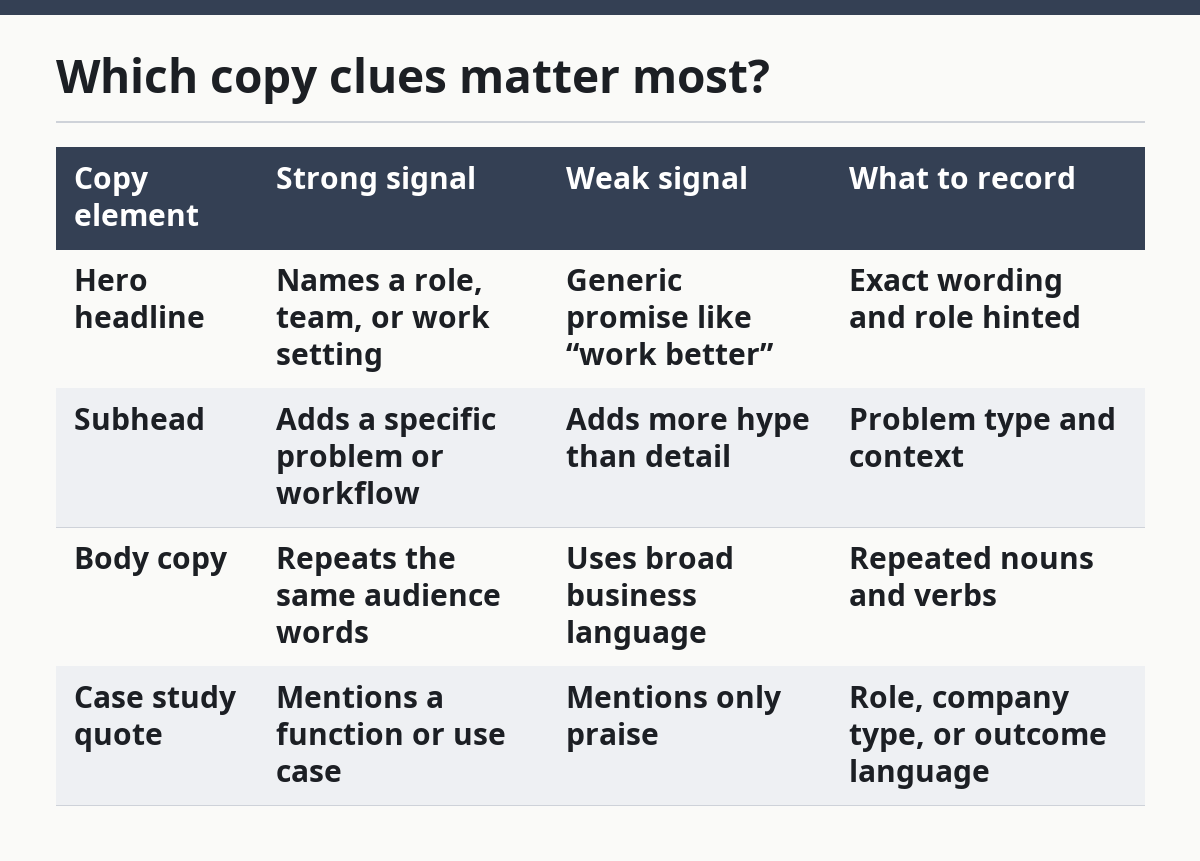
Here is the basic comparison I would put in the sheet:
| Copy element | Strong signal | Weak signal | What to record |
|---|---|---|---|
| Hero headline | Names a role, team, or work setting | Generic promise like “work better” | Exact wording and role hinted |
| Subhead | Adds a specific problem or workflow | Adds more hype than detail | Problem type and context |
| Body copy | Repeats the same audience words | Uses broad business language | Repeated nouns and verbs |
| Case study quote | Mentions a function or use case | Mentions only praise | Role, company type, or outcome language |
The trade-off is simple: broad copy reaches more visitors, but it gives you less evidence. Narrow copy gives sharper signals, but it can be written for a secondary segment. That is why you should never mark a single phrase as proof on its own.
A second useful rule is to watch for excluded groups. If the page talks about “enterprise approvals” and never mentions freelancers, small teams, or solo users, that absence is itself a clue. You do not need a perfect negative signal, but you do need to note when the site keeps returning to one size of customer.
How do CTAs reveal target audience?
CTAs reveal target audience by showing what action the site expects a visitor to take and how much commitment it asks for. A “Start free” button usually points to lower-friction evaluation, while “Book a demo” usually points to a higher-touch sales path, though the exact meaning depends on the rest of the page and on general UX guidance about clear calls to action (Baymard Institute, Nielsen Norman Group).
The first CTA on the page matters most. Put it in the sheet exactly as written, then note its position: hero, sticky nav, feature block, or footer. A page that repeats the same CTA 3 times is saying the offer is central, not decorative.
CTAs also reveal maturity of buyer. “Get started” implies fast self-serve motion. “Talk to sales” or “Request pricing” implies a slower buying process and often a team decision. If the CTA sits beside language about security, integrations, or admin controls, that usually points toward a more complex buyer group.
Use this 4-part read:
- verb: start, try, book, request, talk
- effort: low, medium, high
- audience posture: self-serve or sales-led
- next step promised: trial, demo, pricing, or contact
That read is more useful than trying to guess persona from button color or design style. Color is presentation; verb choice is intent. If the site offers 2 different CTAs, note which one gets the lead position and which one gets pushed lower on the page.
One caution: a demo CTA does not automatically mean enterprise. Small teams buy demos too, especially when the product is technical or the workflow is hard to explain in a signup flow. The CTA should be read with the rest of the page, not treated as a standalone verdict, and a professional who is reviewing the site in context may still reach a different conclusion.
How does feature emphasis change the read?
Feature emphasis changes the read by showing which problems the product wants to be known for, not just what it can do. Feature lists are often the clearest place to spot the persona because they use concrete nouns, module names, and workflow terms.
Start by counting what appears first in the feature section. If the first 3 features are about permissions, audit logs, and admin control, the product is probably speaking to a controlled buying environment. If the first 3 are about templates, automation, and quick setup, the page is likely speaking to speed and ease.
A useful filter is to sort features into 3 buckets:
- user-facing workflow features
- admin or control features
- integration and infrastructure features
That split helps you see who the page is trying to persuade. Workflow features often point to the daily user. Admin features point to the manager or buyer. Infrastructure features point to IT, ops, or a technical decision-maker.
Feature emphasis becomes especially clear when one category dominates the page. If most of the space is about reporting, security, or permissions, the page is probably not mostly for casual users. If the page spends most of its space on ease, templates, and fast setup, it is probably trying to reduce friction for a broad audience.
Do not confuse feature quantity with importance. A long list can hide the real focus, so you need to note hierarchy: headline, subhead, first 3 cards, and any repeated nouns. A feature named once in a footer is weak evidence; a feature named in the hero and again in a product block is stronger.
How do you score the evidence without forcing it?
You score the evidence by ranking each clue as strong, medium, or weak and then checking whether the same audience shows up in at least 3 places. That is enough structure to keep the sheet honest without turning it into a math exercise.
A simple scoring pass works like this:
- Strong: the clue appears in 2 or more major page areas
- Medium: the clue appears once in a prominent spot
- Weak: the clue appears once in a low-visibility spot or sounds generic
After that, write one short conclusion sentence: “This page seems aimed at X because Y appears in copy, CTA, and feature emphasis.” Keep the sentence plain. If you need 3 clauses to explain it, the evidence is probably mixed.
This is also where you note conflict. A site can speak to both managers and users, or to both SMB and enterprise. When that happens, do not force one persona from 1 homepage. Write the split and say which clue is dominant.
The honest trade-off is that a cleaner conclusion may leave out nuance. That is fine if the goal is fast positioning analysis. If the goal is coverage planning, you would need a different sheet. This page is for public signals, not for building a full reader segmentation system.
A good habit is to timestamp the sheet. Even a simple note like “May read” or “June pass” helps because homepage copy changes. A stale sheet can mislead you more than a blank one.
When should you stop and say the page is mixed?
You should stop and say the page is mixed when the copy, CTA, and features point to different buyers with no dominant pattern. That happens often in SaaS, and pretending otherwise produces false confidence.
Three common mixed cases show up often:
- The hero speaks to executives, but the features speak to operators.
- The CTA is self-serve, but pricing and security language suggest a sales-led motion.
- Case studies point to one industry, but the homepage copy stays generic.
When that happens, your sheet should name the split instead of smoothing it out. A good conclusion might say the page leans toward one audience for acquisition and another for evaluation. That is more useful than a fake clean answer.
This is not the right method if the page has almost no text, if the product is sold mostly through partners, or if the homepage is a thin shell that sends people elsewhere on the site. In those cases, the evidence sheet will be too sparse to support a real persona call.
The best use for the sheet is often side-by-side comparison across 2 or 3 SaaS pages. That is where pattern recognition becomes visible. It also fits naturally with the broader work in saas audience and positioning signals, because the sheet turns a page into a set of readable clues instead of a vague impression. For related workflow planning, see the homepage positioning checklist and compare SaaS landing page copy.
How do you infer a SaaS persona from the website?
You infer a SaaS persona from repeated signals in the homepage copy, CTAs, feature sections, pricing language, and case studies. The key is repetition across at least 3 areas, not a single line that sounds specific. A phrase that appears once may be a marketing flourish; a phrase that appears in the hero, a feature block, and a case study is stronger evidence. For a quick reminder of the structure, use the persona evidence sheet template.
What are persona clues in SaaS copy?
Persona clues in SaaS copy are words that point to a role, workflow, company size, or buying setting. Terms like “team,” “ops,” “admins,” “founders,” or “finance” matter because they show who the message is trying to reach. The same is true for problem words such as “reporting,” “approvals,” “templates,” or “automation.” If you want adjacent context, read the SaaS messaging guide.
How do CTAs reveal target audience?
CTAs reveal target audience by showing the expected next step and the amount of friction in that step. “Start free” usually suggests a lighter buying motion, while “Book a demo” or “Request pricing” usually suggests more evaluation. The real clue comes from matching the CTA to the rest of the page, not from the button alone. You can compare that pattern in the CTA audit checklist.
What goes into a persona evidence sheet?
A persona evidence sheet needs the exact wording, the page element it came from, the inferred signal, and a confidence note. A 4-column sheet is enough for most homepage reads. If you keep it to 10 to 15 rows, it stays readable and useful instead of becoming a dump of copied text. For teams, the positioning worksheet can sit beside it.
Drafted with AI; not yet reviewed by a person.