






A SaaS homepage can tell you in 30 seconds whether the product is aimed at your role, your stage, and your problem. This guide on How to Read a SaaS…
Last updated: November 12, 2026
A SaaS homepage can tell you in 30 seconds whether the product is aimed at your role, your stage, and your problem. This guide on How to Read a SaaS Homepage for Buyer Fit Signals from Copy, Proof, and CTA shows you how to read the homepage, the proof, and the CTA so you can spot fit fast. It also points you to the hub on SaaS product pages and positioning for the wider context. Quick Answer: use 30 seconds to check role, proof, and CTA.
Our Top 3 Picks at a Glance
This article does not rank products. It helps you judge a SaaS homepage by fit signals in the copy, proof, and CTA.
| Option | Best For | Core Spec | Standout Feature | Action |
|---|---|---|---|---|
| SaaS homepage | Quick fit checks before a demo | Homepage, hero section, testimonial, CTA, pricing link | Shows role, pain, and decision stage in one page | Read the copy and CTA together |
| Copy-only read | Early screening when proof is thin | Headline, subhead, feature bullets | Fast clue about audience and use case | Check wording against your job to be done |
| Proof-heavy read | Late-stage evaluation | Testimonials, logos, case studies, pricing link | Reveals who already buys and why | Compare proof to your company size and stack |
What a SaaS homepage is really telling you
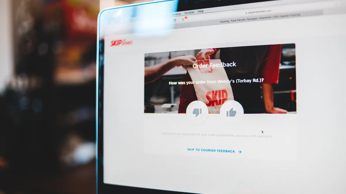
A SaaS homepage is telling you who the product is for, what pain it claims to solve, and how far down the buying path the company expects you to be. In How to Read a SaaS Homepage for Buyer Fit Signals from Copy, Proof, and CTA, that means reading the page as a fit check. That may sound simple, but it is not.
For example, you may land on a homepage with a sharp hero section, a row of logos, and a bright CTA button. In 30 seconds, you still need to know whether the page is written for a solo operator, a manager, or an enterprise buyer. That is the fit signal. It lives in the page structure, not just the headline.
Here’s the catch: many homepages try to look broad. They do this because broader wording catches more traffic, but it can also hide the real buyer. So the trick is to read for specificity, not polish.
Look for these first:
- Role words like “founders,” “revops,” “finance teams,” or “IT.”
- Problem words like “manual reporting,” “churn,” “handoffs,” or “approvals.”
- Stage words like “start free,” “book a demo,” or “talk to sales.”
- Environment words like “for agencies,” “for mid-market,” or “for teams with Salesforce.”
A homepage that names a role and a pain in the same breath is usually speaking to a tighter buyer profile. A homepage that stays abstract may still be good, but it is harder to read. On a 20-second scan, that matters.
How do I read copy cues on a SaaS homepage?
Copy cues tell you whether the product was written for your problem, your team size, and your level of urgency. The fastest read is often the hero section, while the stronger signal comes from repeated terms across the page.
For instance, if you’re scanning the headline, the subhead, and the three feature bullets, the wording can seem smooth. You still need a yes-or-no answer before you click the pricing link. That means you have to read for named workflows, named users, and named outcomes.
Start with the words that repeat in the first screen and the next scroll. If the homepage says “close the books faster,” “review tickets,” and “approve spend,” it is pointing at operational control. If it says “capture leads,” “send campaigns,” and “book more demos,” it points somewhere else. Same product category, different buyer.
Use this quick procedure:
- Read the headline once. Ask who is named, if anyone. If it says “for product teams” or “for finance leaders,” that is a real signal.
- Read the subhead. Check whether it states a job, a pain, or a result. A vague phrase like “grow with confidence” gives less away than “replace spreadsheet forecasting.”
- Scan the feature bullets for verbs. “Automate,” “track,” “route,” and “approve” tell you more than “simple,” “smart,” or “modern.”
- Look for excluded buyers. Phrases like “for enterprise teams” or “not another point tool” tell you who is not the target.
- Compare the copy to your own use case. If you need procurement controls and the page talks only about individual productivity, consider whether to consult a procurement or legal professional and check an authoritative source such as the FTC’s Business Blog before proceeding.
A strong fit page usually has one clear job and one main buyer. A weak fit page often tries to please three buyer types at once. That blur costs you time.
What proof cues matter more than logos?
Proof cues matter most when they show a buyer like you, not just a famous brand. A row of logos can look impressive, but a single testimonial with a role, a use case, and a result is often more useful.
Then, if the homepage has eight logos, two testimonials, and a case study link, you can use that proof to decide whether the product is for startups, mid-market teams, or regulated companies. The proof section should narrow that down. If it doesn’t, the proof is decorative.
The strongest proof signals are specific:
- Testimonials that name the role, like CFO, RevOps, or Head of Support.
- Customer logos from a size band you recognize.
- Case studies that match your workflow or industry.
- Security or compliance marks when you need them.
- Pricing link placement that shows whether self-serve is part of the motion.
A testimonial that says “We saved hours” is weaker than one that says “Our sales team stopped manual handoffs between HubSpot and Slack.” The second one reveals a workflow, a stack, and a team shape. That is the useful part.
Be careful with proof that sounds broad but proves little. “Trusted by thousands” sounds large, but it tells you nothing about fit. So does a logo wall with no context. If you are a 30-person company and the page only shows giant brands, the product may still work, but the seller may be optimized for a different buyer motion.
Two details matter a lot:
- A testimonial near the CTA usually backs the next step.
- A proof block above the pricing link usually tries to lower fear before the ask.
If the proof answers “who uses this?” and “why do they stay?”, you have something useful. If it only answers “can this brand buy it?”, keep reading.
How do I read proof and CTA together?
Proof and CTA together show whether the company expects you to buy now, evaluate later, or talk to sales first. That pairing tells you more than either element alone.
For example, the homepage may say “Start free,” but the only proof is enterprise logos and a long security page. Or it may say “Book a demo,” but the testimonials read like self-serve SMB stories. That mismatch is a buyer-fit clue. The motion and the proof should point in the same direction.
Read the CTA as a stage signal:
- Start free usually means lighter setup, lower risk, and a self-serve path.
- Get started often sits between self-serve and sales-led.
- Book a demo usually means higher ACV, more setup, or a sales-assisted motion.
- Talk to sales often signals custom pricing, approvals, or enterprise buying.
Now match that CTA to the proof. If the CTA asks for a demo, the proof should usually support a more complex sale: security language, implementation help, or quotes from larger teams. If the CTA asks for a trial, the proof should make the product feel fast to adopt.
When the two clash, ask why. A small-company story with an enterprise CTA may mean the company wants larger accounts but still has thin proof. An enterprise-proof page with a free-trial CTA may mean the product is broad enough for both ends, or that the seller wants volume. It is not always bad. It is, however, a sign to check the next page carefully.
One clean rule helps: the CTA should match the buyer effort the page is asking for. If the page promises speed and the CTA asks for a 45-minute demo, that tension is real. If the page promises control and the CTA is a free trial with little guidance, that is also tension.
What does persona targeting look like on a homepage?
Persona targeting looks like the page talking to one person in one job, not to every possible user in the company. The strongest signal is a role plus a pain plus a workflow in the same 1-2 lines.
If you’re a finance lead, but the homepage talks to “makers,” “builders,” and “teams who move fast,” that may be a fine product, but it is not speaking your language. If the page names your role, your approval process, or your system of record, you’re closer to the target.
Look for these persona clues:
- Job titles in the headline or subhead.
- Team names in feature labels.
- Workflow words tied to the role, like “approve,” “route,” “forecast,” or “triage.”
- Integrations that fit the persona’s stack, such as Salesforce for revenue teams or QuickBooks for finance teams.
A homepage can also signal a decision stage. A page built for early-stage buyers often has educational copy, broad benefits, and a low-friction CTA. A page built for late-stage buyers often has pricing, implementation detail, security language, and stronger proof. The further down the funnel, the less hand-wavy the copy tends to be.
A useful test is simple:
- If you need a manager or founder to champion the purchase, is that person named?
- If IT has to approve it, does the page mention security, SSO, or admin control?
- If the user and the buyer are different people, does the page address both?
When the homepage only speaks to the end user, the buying process can get awkward. When it only speaks to the executive, it may miss the daily user. Balance matters, but the page still needs a clear lead voice.
Common mistakes that hide a bad fit
The most common mistake is reading polish as fit. A slick homepage can still be aimed at the wrong customer, the wrong company size, or the wrong buying motion.
If the design feels expensive, the copy sounds confident, and the testimonial looks good, you may be tempted to move on. That is where people get burned. The page can look premium and still be wrong for your workflow.
Watch for these traps:
- Generic benefit words like “efficiency” or “growth” with no named job.
- Logo-only proof with no role, use case, or industry context.
- CTA mismatch where a tiny team is told to book a demo for a simple task.
- Feature overload that hides the actual first use case.
- Pricing link buried so deep that the company does not want self-serve buyers.
The cost of this mistake is time, not just attention. You may book a demo for a product built for a different buyer, or skip a good fit because the page is too broad. Both happen often.
The fix is to read the homepage like a map of intent:
- Identify the named buyer.
- Identify the named pain.
- Check the proof for a matching company type.
- Check the CTA for the expected buying step.
- If two of the four are off, treat the fit as weak until the product page proves otherwise.
A homepage does not have to say everything. It does have to say enough. If it won’t tell you who it is for, believe that silence.
How this page fits into the bigger SaaS page stack
This page fits as the fast filter before deeper page review, not as the final word on product quality. The homepage gives you the first signal; the product pages and pricing pages do the heavier work.
Once you have that first signal, move to the product page, the pricing link, and the specific integration or security pages. That sequence saves time.
Use the homepage to answer three questions:
- Is this written for someone like me?
- Does the proof match my kind of company?
- Does the CTA match the kind of buying motion I can support?
If the answer to all three is yes, keep going. If one is off, slow down. If two are off, the page is probably not speaking to your buyer profile.
This is also where the hub matters. The broader hub on SaaS product pages and positioning gives the larger frame, but the homepage does the first cut. That’s the practical order: read the homepage, then go deeper only if the fit signals line up. For related context, see the guide to SaaS product pages and positioning and homepage copy frameworks.
Key Takeaways
- A SaaS homepage is a fit check, not just a brand page.
- Copy tells you the role, pain, and buying stage.
- Proof tells you who already buys and whether they look like you.
- CTA language shows how much effort the seller expects from you.
- When proof and CTA point in different directions, pause and verify.
How do I tell if a SaaS homepage is aimed at my role?
A SaaS homepage is aimed at your role if it names your job, your team, or your workflow in plain language. Look for terms like finance, sales, IT, ops, or support, then check whether the copy matches the tasks you actually own. If the page only talks to a different function, the fit is weak even if the product sounds good.
What copy signals indicate buyer fit?
Copy signals indicate buyer fit when they name a specific user, a real problem, and a clear outcome in the same page. Role words, workflow verbs, and industry terms are stronger than broad claims like “save time” or “grow faster.” A good sign is repeated wording that matches your process, and you can compare it with positioning basics if you want a wider frame.
Drafted with AI; not yet reviewed by a person.
