Read a SaaS homepage in 3 passes—navigation, CTA hierarchy, then scroll order. In How to Read a SaaS Homepage for Navigation, CTA Hierarchy, and Page…
Last updated: November 16, 2026
Quick answer: read a SaaS homepage in 3 passes—navigation, CTA hierarchy, then scroll order. In How to Read a SaaS Homepage for Navigation, CTA Hierarchy, and Page Priorities, those 3 passes show what the company wants a visitor to do first, second, and third.
Key takeaways
- The top navigation tells you which paths the company wants to keep visible, not just which pages exist.
- The strongest CTA is often the one that gets the shortest path, the highest contrast, and the most repeated placement.
- The hero section usually sets the first job for the page; later sections either support it or compete with it.
- A homepage that tries to do four jobs at once is usually weaker than one that pushes one action clearly.
- If the homepage hides pricing, demo, or signup behind equal-weight buttons, that is a sign to slow down and ask what the page is optimizing for.
How do I read a SaaS homepage step by step?

You read a SaaS homepage by starting at the top, then following the page as a visitor would move through it in the first 10 seconds. The goal is to rank the company’s page priorities, not to judge design taste.
- Scan the navigation menu for 5 to 8 top-level items and note which ones point to product, pricing, customers, resources, or login. The result you want is the company’s first map of what matters enough to show at the top.
- Check the hero section for one headline, one short supporting line, and one main action. If the hero offers 2 competing buttons with equal weight, the page is already split between 2 goals.
- Identify the primary button by color, size, and placement. A primary button that repeats above the fold and again after the first section is usually the page’s main conversion path.
- Compare the secondary CTA to the primary one. If the second button says “Watch demo,” “See pricing,” or “Learn more,” it is usually there for people who are not ready to commit in 1 step.
- Read the social proof block for the kind of proof used: customer logos, review counts, security marks, or short quotes. The type of proof shows what kind of doubt the page is trying to reduce.
- Map the feature section order and note which feature appears first, second, and third. The first feature block usually tells you what the company thinks is easiest to understand or most saleable.
- Follow the scroll order to see what comes before proof, before details, and before the final CTA. If the page puts proof before features, it is trying to build trust early; if it puts feature detail first, it is trying to explain the product before asking for action.
That sequence works because a homepage is a priority stack, not a poster. A company with a 3-step sales motion will often show different cues than one pushing self-serve signup, and that difference shows up in the first screen long before the footer. For related examples, see the SaaS website audit checklist and the homepage CTA analysis guide.
What does the navigation menu tell you?
The navigation menu tells you what the company believes a visitor needs most without scrolling. A SaaS homepage rarely gives every page equal weight, so the menu is the cleanest clue to page priorities.
Look first at how many items sit in the top bar. A tight menu with 4 or 5 items usually signals a focused path, while a wider menu with 7 or 8 items often means the company is serving more than one visitor type or sales motion. The number matters because each extra item dilutes attention.
Then compare the labels. “Product,” “Solutions,” and “Customers” point to different intents, and “Pricing” is a very different signal from “Contact sales.” One says the company expects a visitor to self-qualify; the other says human help may be part of the path.
Watch for a right-side action in the menu. If the nav ends with a button-like item such as “Start free” or “Book demo,” that is usually the strongest top-level CTA on the whole page. If the login link is more visible than the CTA, the page may be serving existing users as much as prospects.
The trade-off is simple: a dense menu helps a broad audience, but it weakens focus. That is fine for a complex platform with multiple use cases, and less useful for a simple tool that should push one next step. A homepage that looks like a directory often costs the company clarity.
How do I read CTA hierarchy on a SaaS homepage?

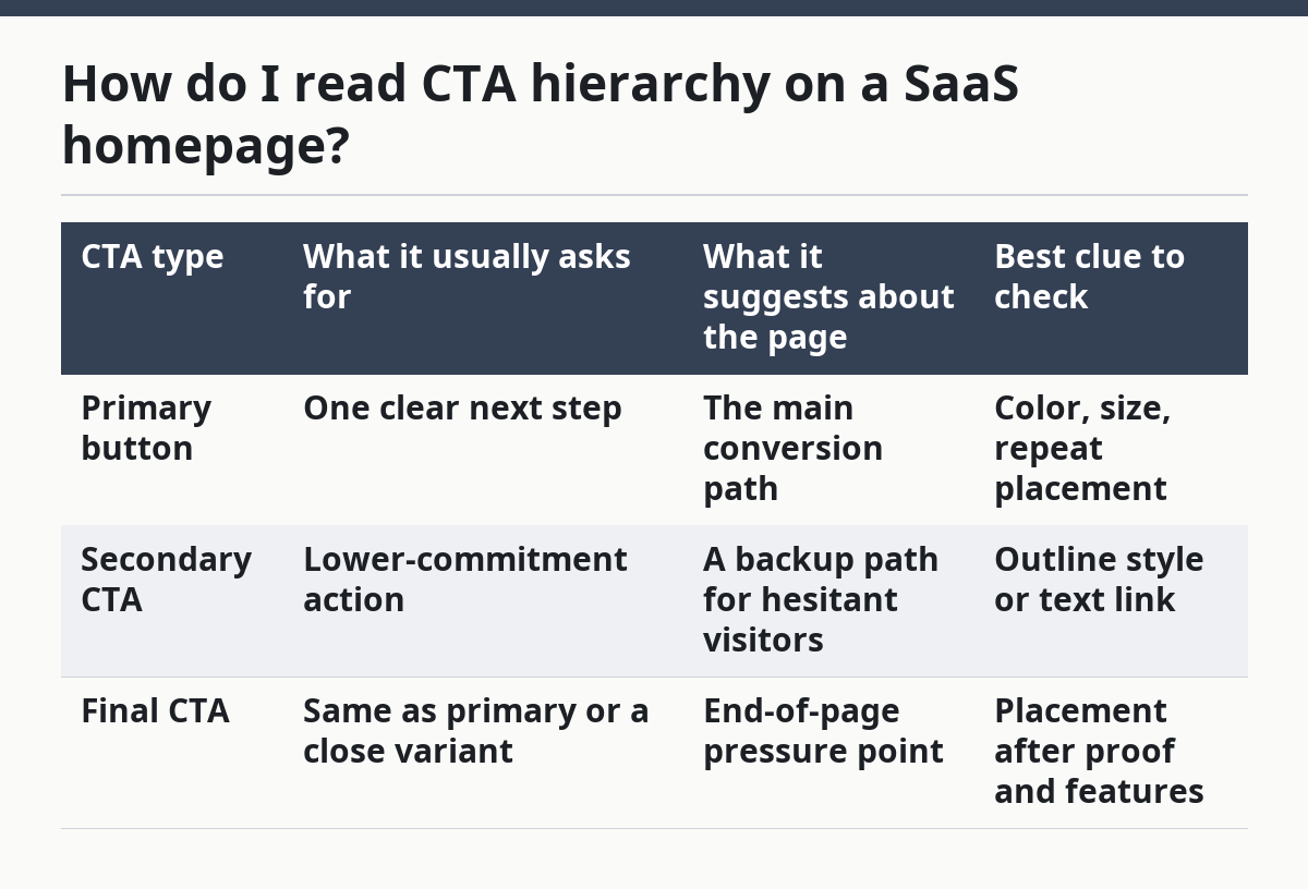
You read CTA hierarchy by asking which action the page gives the best placement, the highest contrast, and the fewest choices. The primary button, secondary CTA, and repeated close buttons are often the clearest clues.
Start with the hero. If one button is filled and the other is outlined, the filled button is usually the primary CTA. If both are filled or both are text links, the hierarchy is weak and the page may be trying to avoid choosing a winner.
Then look at repetition. A strong SaaS homepage often repeats the same primary action after the hero, after a feature section, and near the bottom. That repetition is not noise; it is the page saying, in 3 places, what it wants the visitor to do.
Compare the wording. “Start free” pushes fast commitment. “Book a demo” pushes sales contact. “See how it works” sits in the middle and is often used when the company expects more explanation before conversion. The wording tells you what kind of friction the company expects.
| CTA type | What it usually asks for | What it suggests about the page | Best clue to check |
|---|---|---|---|
| Primary button | One clear next step | The main conversion path | Color, size, repeat placement |
| Secondary CTA | Lower-commitment action | A backup path for hesitant visitors | Outline style or text link |
| Final CTA | Same as primary or a close variant | End-of-page pressure point | Placement after proof and features |
The honest downside of CTA hierarchy is that it can hide mixed goals. A homepage that promotes “Start free” and “Book demo” with equal force may be serving two funnels at once. That is not automatically wrong, but it means the page is harder to read and usually harder to act on in 1 glance.
What should I look for in the hero section?
You should look for the hero section to tell you the page’s main promise in one pass. The hero is the first place where the homepage says what the product is for and what action the company wants next.
Check the headline first. A plain headline usually names the job or category, while a vague headline leans on brand feel. If the headline takes 2 lines to explain itself, the page may be spending too much of the first screen on wording instead of direction.
Then check the subheadline. A good supporting line narrows the promise, often by naming a result, a user group, or a setup path. If the subheadline just restates the headline in new words, the page is wasting space that could support proof or action.
Now check the media. A product screenshot, dashboard image, or short animation can show what the software looks like in use, while a generic illustration often says less. The choice matters because the hero has only about 1 screen of attention on many devices, and that space has to earn the next click.
A strong hero usually has 3 jobs: explain, point, and reduce doubt. If it does only 1 of those, the rest of the page has to work harder. If it tries to do all 3 with 4 messages at once, the result is usually blurred.
How do I rank homepage sections by priority?
You rank homepage sections by seeing which ones answer the visitor’s next question first. The scroll order is the clearest sign of what the company thinks matters after the hero.
Look at the first 3 sections after the hero. If the page goes from promise to social proof, it is trying to build trust early. If it goes from promise to feature detail, it is trying to explain the product before asking for belief. If it goes from promise to customer logos to feature blocks to final CTA, the page is arranging a simple trust path.
The social proof block is especially important. Customer logos, short quotes, security notes, and review marks do different work, and the type of proof used usually matches the doubt the company expects. A proof block near the top says, “Believe this before you read much farther.” A proof block near the bottom says, “You’ve seen enough; now act.”
Feature sections show what the company wants remembered. The first feature block is often the most commercially useful or easiest to understand, while later blocks fill in the rest. If the page starts with a technical detail before a clear benefit, it may be written for a more informed buyer than a casual visitor.
A homepage is strongest when each section earns the next scroll. If you can remove a section and the page still says the same thing, that section was probably decoration. That is the test I use for priority, and it is harsher than judging copy alone.
What mistakes hide the real page priority?
One common mistake is treating every visible element as equal. A homepage can show 10 items and still have only 1 real priority, so reading every block as if it matters the same leads to the wrong conclusion. If this is tied to a high-stakes marketing or conversion decision, consult a qualified UX or CRO professional; Nielsen Norman Group’s guidance on navigation and hierarchy is a useful starting point.
One common error is overreading the footer. The footer often contains utility links, legal pages, and a sitemap-style list that is useful for access but weak for priority. It is the least useful place to infer the main conversion path.
Another mistake is assuming a flashy homepage has a strong hierarchy. Motion, color, and large imagery can cover weak structure. If the page has 3 CTAs, 2 competing headlines, and no clear first action, style does not fix the hierarchy.
A third mistake is ignoring the repeat pattern. If the same CTA appears in the hero, mid-page, and final section, that repetition is a clue, not redundancy. It means the company wants the same action to feel natural at 3 points in the scroll.
The trade-off is that some SaaS homepages are built for more than 1 audience. A platform used by buyers, operators, and admins may have to support different entry points. In that case, the page is not broken just because it looks crowded, but it is harder to read and usually less decisive.
For a broader framework, this article fits inside the site’s larger SaaS homepage and landing page analysis hub, which breaks down how public signals show what a company wants visitors to do.
What does homepage navigation reveal about a SaaS company?
Homepage navigation reveals which paths the company wants visible before a visitor scrolls. A short menu usually signals a tighter focus, while a larger menu suggests more than one audience or sales motion. The labels matter too: “Pricing,” “Demo,” and “Login” tell very different stories about how the company expects people to move. For a related breakdown, see homepage navigation analysis.
How do I read CTA hierarchy on a SaaS homepage?
You read CTA hierarchy by checking which action gets the most visual weight and the shortest path. The primary button is usually the one with the strongest color, the clearest placement, and the most repeats down the page. If two CTAs look equally important, the homepage is splitting attention. For more examples, see CTA hierarchy examples.
What should a SaaS homepage prioritize?
A SaaS homepage should prioritize the main next step, then the proof that supports it, then the details that reduce doubt. That order can shift if the product is complex, but the page still needs one clear lead action. If the homepage tries to prioritize everything, it usually ends up prioritizing nothing.
Sources
- W3C WAI-ARIA Authoring Practices Guide, Menubar Pattern: https://www.w3.org/WAI/ARIA/apg/patterns/menubar/
- Nielsen Norman Group, navigation and menu design guidance: https://www.nngroup.com/topic/navigation/
- Nielsen Norman Group, call-to-action and homepage usability guidance: https://www.nngroup.com/topic/homepage/
Drafted with AI; not yet reviewed by a person.