In 3 checks, you can read a SaaS upgrade path for trigger points, gated features, and sales handoff: find the trigger, find the gate, and follow the next…
Last updated: November 16, 2026
Quick Answer: In 3 checks, you can read a SaaS upgrade path for trigger points, gated features, and sales handoff: find the trigger, find the gate, and follow the next click. In this guide to How to Read a SaaS Upgrade Path for Trigger Points, Gated Features, and Sales Handoff, those 3 checks show what the product wants users to do next, what is gated behind a plan, and when a sales contact form takes over from the checkout flow.
Key takeaways
- An upgrade path is not just a price page; it is the sequence of prompts and locks that push a user toward a higher plan.
- Trigger points can be action-based, like a trial limit, or feature-based, like a locked feature that appears at the wrong moment.
- The handoff to sales usually shows up in forms, “contact sales” buttons, or plan gates that remove self-serve checkout.
- The clearest paths show a simple ladder: discover a limit, hit a prompt, compare plans, then either upgrade yourself or talk to sales.
- The wrong read is to treat every locked item as a buying signal; some are there to protect support load, not to force a sale. When the meaning is unclear, consider checking with a product or pricing specialist and compare the pattern with guidance from OpenView on product-led growth and HubSpot on sales handoff.
What is a SaaS upgrade path?

A SaaS upgrade path is the sequence a user follows from trying the product to paying for a larger plan. It usually starts with a free tier, a trial, or a low-cost plan, then uses prompts, plan gates, and locked features to show what comes next.
The key idea is movement, not pricing math. A good upgrade path tells you which actions matter most to the product team, because those actions are the ones tied to trial limits, usage caps, or feature gates. If a user can still complete the core job on a free plan, the path is usually gentle; if the core job is blocked after a small threshold, the path is sharp.
That difference matters for anyone reading SaaS product intelligence from public signals. A path with three steps and one locked feature says something very different from a path that jumps straight to a sales contact form. One is built for self-serve conversion. The other is built to qualify accounts before a human gets involved.
A simple way to think about it is this: the upgrade path is the product’s pressure system. It shows where the vendor is willing to let users go for free, where it starts asking for payment, and where it stops asking and starts routing to sales. For a reader comparing products, that tells you more than a price alone.
Where do trigger points show up?
Trigger points show up where a product decides the current plan is no longer enough. They often appear as a message after a user action, such as adding a team member, exporting a report, creating more projects, or opening a feature that belongs to a higher tier.
The clearest trigger points have three parts: the action, the message, and the next step. The action is what the user tried to do. The message says why the action is blocked or limited. The next step points to upgrade, trial extension, or sales. If any of those pieces are missing, the path is vague and harder to read.
A practical reading method helps here:
- Start at the first paywall-like moment. Look for the exact user action that causes a change, such as clicking a feature, reaching a trial limit, or opening a restricted menu.
- Note the trigger type. If it is a usage cap, a time limit, or a plan gate, write that down separately, because each one sends a different signal about the pricing model.
- Read the prompt text. A prompt that says “Upgrade now” is different from one that says “Talk to sales.” The first usually means self-serve is still open. The second usually means a human handoff is near.
- Check what is still visible after the block. If the locked feature is described in detail, the vendor is still selling to the user. If it disappears, the path is more abrupt.
- Follow the next click. If the next step lands on pricing, checkout, or a sales contact form, you have found the path’s real endpoint.
This is where many readers stop too early. They treat a trigger point as a yes-or-no gate, when it often works more like a funnel stage. A trial limit might not kill the product experience at once. It may just move the user into a stronger upgrade prompt after the second or third blocked action. If the pattern is unclear, consider a product analyst or pricing specialist and compare it with SaaS pricing guidance from ProfitWell and OpenView.
Which locked features matter most?
The locked features that matter most are the ones tied to the product’s core job, not the decorative extras. A locked dashboard theme is weak signal. A locked export, automation rule, integration, or permission control is stronger signal because it sits closer to daily use.
A locked feature tells you two things at once: what the vendor wants to reserve for paid plans and how painful the free plan is meant to feel. If the locked item is visible in the main workflow, the product is trying to create a moment of friction at a natural point of need. If it is buried in settings, the signal is weaker and often meant for discovery rather than conversion.
The trade-off is simple. A product with many visible locked features can create more upgrade prompts, but it can also annoy users before they see value. A product with fewer locks may feel friendlier, but it gives fewer clues about monetisation. It depends on whether the product is built for product-led growth, sales-led motion, or a mix of both.
For reading purposes, I look for three kinds of locked features:
- Core workflow locks: features needed to finish the main job.
- Capacity locks: features that matter only when a team grows, such as more seats or more workspaces.
- Control locks: features like permissions, audit logs, or admin settings that usually signal a more mature account.
The last group often points to plan gates rather than simple upsells. That matters because a plan gate is more than a feature tease. It is the boundary between “you can try this alone” and “you need a bigger account structure.”
How do upgrade prompts work?
Upgrade prompts work by naming the value gap at the exact moment a user feels it. A good prompt does not just say “Upgrade.” It connects the blocked action to a plan, a benefit, or a reason to move now.
The wording tells you a lot. “Try Pro” sounds light and self-serve. “Choose a plan” suggests a comparison step. “Contact sales” points to a later-stage motion. A single product can use all three, and that mix helps map the upgrade path from casual use to serious purchase intent.
The prompt’s placement matters as much as the text. If it appears after a limit is reached, the path is reactive. If it appears before the limit, the path is predictive, which means the product is trying to shape behavior earlier. A prompt on a locked feature page is different from one in the app header or a billing modal. The first reacts to need. The second tries to create it.
A strong upgrade prompt usually has one of these jobs:
- explain what the user just lost,
- show what the higher plan adds,
- or move the user to a next step without making them search.
When a prompt does none of those, it is weak signal. It may still be part of the interface, but it tells you little about the upgrade path itself. The strongest prompts are usually easy to connect to a trigger point, a plan gate, or a sales handoff in one or two clicks.
Where does sales handoff begin?
Sales handoff begins when the product stops offering a direct checkout path and starts asking the user to talk to a person. The clearest signs are a sales contact form, a “book a demo” button, or pricing that moves behind inquiry instead of self-serve purchase.
This is the point where the upgrade path changes shape. Before handoff, the product is trying to convert a user inside the interface. After handoff, the product is qualifying an account. That shift often appears alongside higher-stakes features, team controls, or custom needs, but the exact trigger is the loss of self-serve completion.
A sales contact form is not just a lead form. In this context, it is a boundary marker. It tells you the vendor expects the account to need human review, extra setup, or a plan that is not presented as a simple card on the page. If the form appears right after a locked feature, you are looking at a deliberate handoff point, not a casual contact option.
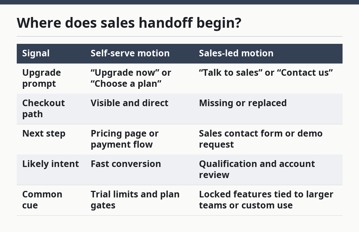
A useful comparison is below.
| Signal | Self-serve motion | Sales-led motion |
|---|---|---|
| Upgrade prompt | “Upgrade now” or “Choose a plan” | “Talk to sales” or “Contact us” |
| Checkout path | Visible and direct | Missing or replaced |
| Next step | Pricing page or payment flow | Sales contact form or demo request |
| Likely intent | Fast conversion | Qualification and account review |
| Common cue | Trial limits and plan gates | Locked features tied to larger teams or custom use |
The trade-off is that sales handoff can be better for complex accounts, but it can also hide the full effort until a rep responds. That is why this signal matters on a pricing and packaging page: it tells you not just what is sold, but how it is sold.
How do self-serve limits change the reading?
Self-serve limits change the reading by showing how much of the path is automated before a human appears. A product with clear self-serve limits usually gives the user a visible route through trial limits, locked features, and plan gates before sales gets involved.
The easiest mistake is to treat any limit as a hard stop. Many products use soft limits first. A user might still log in, explore the app, and see the locked feature even after reaching the limit. In that case, the upgrade path is designed to preserve exploration while narrowing the path to paid use. When the stakes are unclear, consult a product or pricing professional and compare the pattern with Paddle’s pricing resources and G2’s pricing guidance.
Read self-serve limits in this order:
- First, identify the trial limits, if there is a trial.
- Next, note where the product shows a locked feature inside the workflow.
- Then, check whether the upgrade prompt leads to pricing or to a sales contact form.
- Finally, see whether the path changes for smaller versus larger accounts.
That sequence shows whether the product is built for a quick upgrade or a guided sale. If the path stays self-serve until the final click, the vendor is trying to convert low-friction users. If it breaks early, the vendor is probably screening for account size, complexity, or fit.
The trade-off is simple but important. A self-serve path is easier to read and often easier to buy, but it can hide the point at which the product will switch to human support. A sales-led path is more explicit about the handoff, but it gives less direct evidence about how far a user can go without talking to anyone.
What should I ignore when I read one?
You should ignore decorative upgrade signals that do not change the user’s path. A banner that repeats the same offer on every screen is noise. A true upgrade path changes what the user can do, what they can see, or what they must click next.
This is where readers often overread the page. A bright button can be a trigger point, but not every bright button is one. A locked feature is not always a serious gate. A pricing page that lists many tiers is not the same as a path that actually routes users toward one of them. The signal has to alter behavior, not just decorate the interface.
I would also ignore claims that sound generous but do not affect access. If a product says a feature is “available on request,” that can mean a sales process, or it can mean a soft offer with no real motion behind it. The only reliable way to read it is to follow the click trail, look for the sales contact form, and see whether the path ends in a direct upgrade or a human step.
The biggest mistake is to read the upgrade path as if it were only a pricing page problem. It is not. It is a product flow problem, a packaging problem, and a sales routing problem at the same time. That is why the most useful public-signals reading treats the path as evidence, not as decoration. For related context, see the hub on SaaS pricing and packaging strategy and the guide to product-led growth.
What is an upgrade path in SaaS?
An upgrade path in SaaS is the route a user takes from free or lower access to a paid plan. It usually includes a trigger point, a locked feature, and a next step such as an upgrade prompt or a sales contact form. The path shows how the product converts interest into payment.
How do gated features push users toward sales?
Gated features push users toward sales by placing the most useful actions behind a plan gate or a locked feature. When the user hits that block, the product can send them to pricing, a sales contact form, or a demo request. The feature is not just withheld; it is used as the reason to move.
How can you tell where self-serve ends and sales begins?
You can tell self-serve ends when the user no longer has a direct checkout path and the product starts asking for contact details instead. The clearest signs are a sales contact form, a “book a demo” button, or pricing that no longer shows a self-serve purchase option. The handoff point is the first click that removes direct buying.
Drafted with AI; not yet reviewed by a person.