On How to Read a SaaS Pricing Page for Price Anchors, Tier Gaps, and Value Framing , look for 3 signals — the first visible number, the gap between tiers…
Last updated: November 15, 2026
Quick answer: on How to Read a SaaS Pricing Page for Price Anchors, Tier Gaps, and Value Framing, look for 3 signals — the first visible number, the gap between tiers, and the labels around the table. A SaaS pricing page tells you what the vendor wants you to notice first, what it wants you to ignore, and which plan it hopes you pick. Read the pricing table for anchors, tier gaps, and value framing, not just the monthly number.
Key takeaways
- The first number you see is often not the only number that matters; it is usually there to make the next tier feel reasonable.
- The space between the starter plan, pro plan, and enterprise plan tells you how the seller wants to split buyers.
- Value framing shows up in labels, feature groupings, and the words placed above the pricing table.
- A pricing page can guide choice without hiding anything; that still shapes perception.
- The page is for judging packaging logic, not for comparing billing model or contract terms.
How do I read the page in order?

Read the page from top to bottom, then compare the middle tier against the edge tiers. Start with the headline, the pricing table, and the first price you can see, because that is usually the anchor the rest of the page is built around. Then check the starter plan, pro plan, and enterprise plan in the same view if the page shows them together.
-
Read the headline and subhead first. In 1 sentence, decide what the page says the product is for. If the copy says “for small teams” and the table starts at a modest entry price, the page is signaling accessibility before it is signaling depth.
-
Find the anchor. Look for the first visible price, the “most popular” badge, or the plan placed in the center of a 3-tier table. That number is often the reference point that makes the next tier feel normal, even when the jump is large.
-
Compare the gaps, not just the totals. A move from starter to pro can be small or dramatic depending on what is added, removed, or grouped. If the middle tier looks packed and the top tier looks thin, the page is using spacing to make one plan seem more complete.
-
Check what the page repeats. If the same 2 or 3 benefits appear in every tier, the vendor is framing those as standard. If one feature appears only once, it is being used as a boundary marker.
-
Read the enterprise plan as a signal, not a default. On many pricing pages, enterprise is there to set the top end of the range, not to invite most readers upward. That matters because it can make the pro plan look like the practical choice even when the page never says so directly.
This reading order matters because a pricing page is a persuasion surface as much as a menu. If you only scan the visible dollar amount, you miss the structure that gives the amount its meaning.
What do price anchors on a SaaS pricing page mean?
Price anchors are the numbers or labels that set your first sense of what the product should cost. On a SaaS pricing page, the anchor may be the lowest plan, the mid-tier “most popular” choice, or the enterprise plan shown at the far right of the pricing table. The point is not just the number itself; it is the comparison the page wants you to make.
A strong anchor changes the frame before you do any math. If the first price you see is low, the next tier can feel expensive even when it is the better fit. If the first price you see is high, the middle plan can look modest by comparison. That is why a pricing page can make a $1 difference feel smaller than the difference in plan structure around it.
| Anchor pattern | What it pushes you to feel | What to check next | Honest trade-off |
|---|---|---|---|
| Low starter plan | The product feels easy to try | What the pro plan adds in 2 or 3 steps | A low anchor can make upgrades feel steeper later |
| Mid-tier “most popular” plan | The middle feels like the safe choice | Whether the badge matches your actual needs | Popular does not mean best for your use case |
| High enterprise plan | The middle plan looks practical | Whether enterprise is there for real buyers or visual contrast | A high anchor can make smaller plans look cheaper than they are |
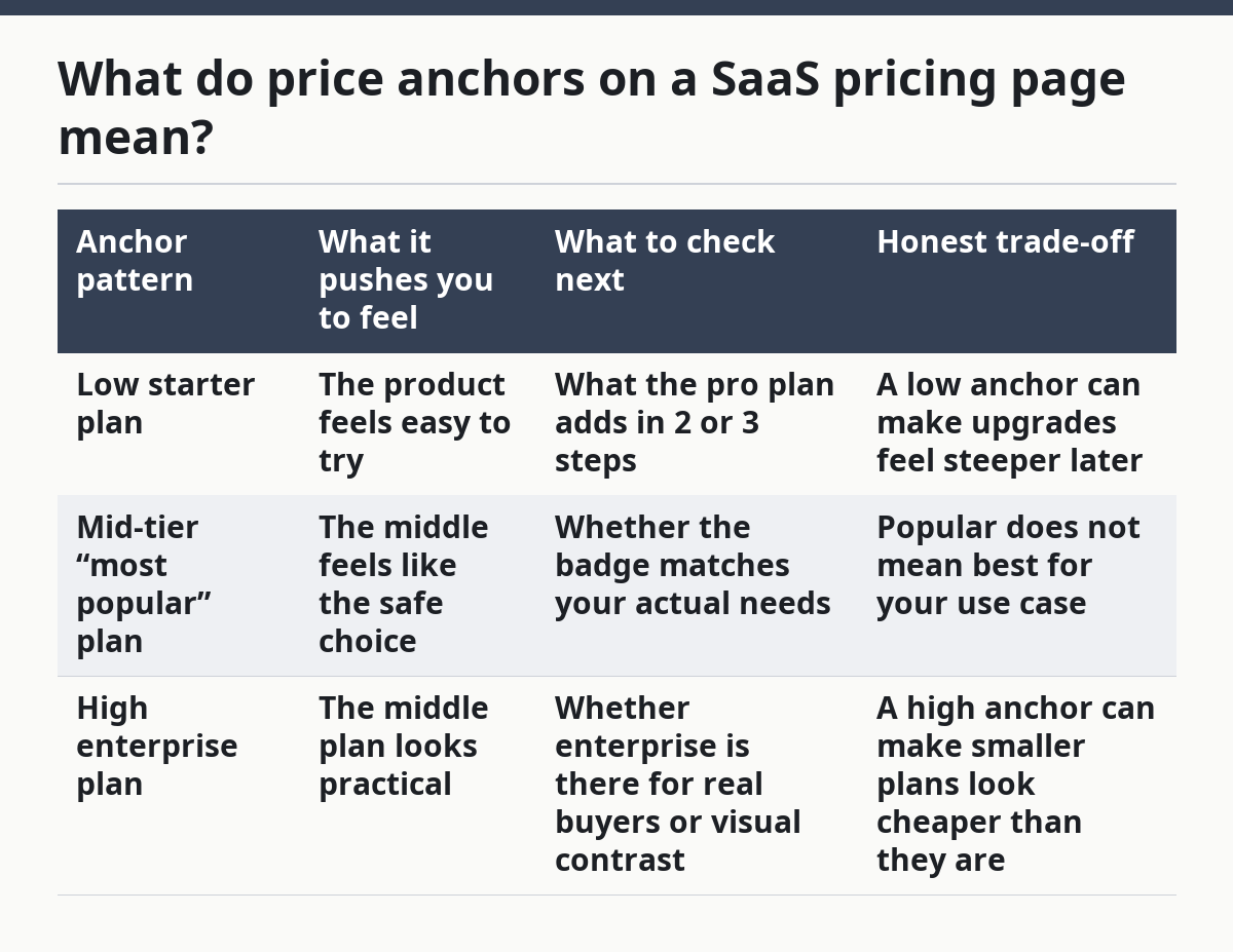
The honest trade-off is simple: anchors help you orient fast, but they can also distort judgment. A page that uses a strong anchor is not automatically misleading. It becomes a problem when the anchor is doing most of the work.
This is where the label matters too. “Starter plan” suggests a low-risk beginning. “Pro plan” suggests the product is for serious use. “Enterprise plan” signals scale, custom work, or a different buying motion. The names are part of the anchor, not decoration.
For a broader look at packaging and presentation, this page sits inside the site’s SaaS pricing and packaging strategy hub and the related pricing page UX guide.
How do tier gaps shape buyer behavior?
Tier gaps shape buyer behavior by making one plan look like the sensible step between too little and too much. A tier gap is the space between plans in price, feature count, or both. If the starter plan and pro plan are separated by a narrow step, the upgrade can feel easy. If the gap looks wide, the page is telling you to hesitate.
The common mistake is to treat every gap as a feature gap only. On many pricing pages, the real message is emotional: “this plan is enough,” “this one is for teams,” or “this one is for serious buyers.” If you are unsure how to judge the gap, a UX professional or pricing consultant can help you compare the plan structure against your buying needs, and the Nielsen Norman Group has long warned that too many choices can make comparison harder.
Here is the practical way to read the gaps:
- Small price gap, small feature gap: The seller wants the upgrade to feel low-friction.
- Small price gap, large feature gap: The seller is nudging you toward the next tier by making the step look cheap.
- Large price gap, small feature gap: The seller may be preserving the high end of the table more than offering a fair jump.
- Large price gap, large feature gap: The table is trying to separate casual users from larger buyers.
The main cost of ignoring tier gaps is overbuying or underbuying for the wrong reason. A buyer may choose pro because the gap from starter is only a few clicks away, not because the added features matter. Another buyer may stay on starter because the jump looks large, even though the missing features create friction later.
That is why the middle tier is often the most important row on the page. It is where the vendor usually tries to make the “reasonable” choice look obvious. If the middle tier absorbs most of the good features, the page is not being neutral; it is steering.
How does value framing steer your attention?
Value framing steers your attention by telling you which features count as the reason to pay. On a SaaS pricing page, value framing appears in the feature list, the section headings, the badge text, and the order of the benefits. It tells you whether the product is selling speed, control, scale, support, or some mix of those.
The first clue is language. If the page repeats words like “team,” “workflow,” or “advanced,” it is framing value around collaboration or depth. If it repeats “starter,” “essential,” or “grow,” it is framing value around gradual adoption. If “enterprise” appears often, the page is probably selling trust, administration, or sales-assisted buying more than self-serve convenience.
The second clue is placement. If one feature sits above the pricing table and the rest sit below, that top feature is the one the seller wants remembered. If the page gives one tier a long bullet list and another tier only 3 bullets, it is not an accident. It is a hierarchy.
A useful habit is to ask, “What would this page want me to say about the product after 10 seconds?” That answer is usually the value frame. It may be “cheap to start,” “worth paying for at pro level,” or “built for larger teams.” The page may support all three, but one will usually lead.
This matters because value framing can make a feature seem bigger than it is. A page can present the same storage, support, or automation capability as either a core benefit or a premium upgrade. The underlying feature may not change, but the framing changes what you think you are buying.
What do plan labels and upgrade cues tell you?
Plan labels and upgrade cues tell you where the company wants the conversation to go next. Labels like starter plan, pro plan, and enterprise plan do more than sort buyers by size. They imply a path, and that path is usually upward. Upgrade cues include “most popular,” “recommended,” contrast colors, and visual emphasis around the middle tier.
The label “starter” usually means the vendor expects light use or first-time buyers. “Pro” usually means the company wants to position the product as something that can support real work. “Enterprise” usually means the buying motion changes, often away from simple self-serve checkout and toward a different sales process. Even without a single extra sentence, those names tell a story.
There are 2 practical signals to watch:
-
The highlighted plan. If one plan is boxed, shaded, or tagged, that is the seller’s preferred choice. The page is using visual weight, not just copy, to shape selection.
-
The upgrade language. If the page says “upgrade,” “best for growing teams,” or “contact sales,” it is marking a boundary. That boundary may be about scale, fit, or buying motion, but the page is signaling that the current plan is not the end state.
The honest trade-off is that labels help readers move faster, but they can hide how loose the categories are. A “starter” plan may suit a small but serious buyer. An “enterprise” plan may be mostly a sales signal. The label is a clue, not proof.
If a pricing page uses labels well, you should be able to tell in under 30 seconds which plan is meant for first-time use, which one is meant to convert, and which one is meant to open a sales conversation. If you cannot, the page is doing too much visual work and too little informational work.
Which red flags mean the page is working on me?
The main red flags are a dramatic anchor, a crowded middle tier, and value language that never names a real trade-off. A pricing page is trying to work on you when it makes every plan sound good, but only one plan looks clean. That is especially true when the page uses the same 2 or 3 benefits to support every tier.
The first red flag is the fake middle. If starter looks too thin and enterprise looks too broad, the pro plan may exist mostly to absorb buyers who do not want the cheapest option. The page can still be fair, but it is clearly shaping the path.
The second red flag is feature fog. If the pricing table is packed with small print and the page keeps repeating abstract benefits, the seller may be making comparison harder than it should be. A clear page can still persuade, but it does not bury the structure under 20 tiny bullets.
The third red flag is one-sided value language. If every tier is described as a win, and no tier is described as a compromise, the page is omitting a real choice. Every packaging decision has a cost. A good page shows some of that cost in plain words.
The point is not to distrust every SaaS pricing page. The point is to read it as a crafted comparison, not a neutral chart. If the table makes one choice feel obvious, that is usually the result of anchor choice, tier spacing, and value framing working together.
What should I do with the page after I read it?
Use the page to name the seller’s structure, then test that structure against your own job to be done. If the page’s anchor, tier gaps, and labels all point to the same plan, that is a strong sign the company has a clear packaging story. If they point in different directions, the page may be trying to serve too many buyer types at once.
At that point, write down 3 things: the plan the page highlights, the plan it makes easy to ignore, and the value it keeps repeating. Those 3 notes often tell you more than the total price. They show whether the company is selling a low-friction start, a serious working plan, or a sales-led top tier.
That is also where you stop. This page is about presentation, not billing model, commitments, or hidden limits. Those deserve their own read, because mixing them into this one question makes the signals muddy.
What do price anchors on a pricing page mean?
Price anchors are the numbers and labels that set your first sense of what the product should cost. On a SaaS pricing page, the anchor may be the starter plan, the middle plan, or the enterprise plan, and it works by changing what feels expensive or normal next to it.
The anchor matters because it shapes the comparison before you do any careful reading. A low anchor can make the middle tier feel steeper. A high anchor can make that same middle tier feel modest. The number is only part of the message; its position in the pricing table does most of the work.
How do tier gaps shape buyer behavior?
Tier gaps shape buyer behavior by making one plan feel like the natural next step. A small gap can make upgrading feel easy, while a wide gap can make the same move feel like a bigger commitment.
The gap also tells you what the vendor values. If the pro plan gets most of the useful features, the page is nudging buyers toward the center. If the enterprise plan holds the strongest features, the page is separating serious buyers from everyone else. That is not a flaw by itself, but it is a choice.
How can you tell what value the pricing page is emphasizing?
The value being emphasized is usually the one repeated in the headline, the feature list, and the highlighted tier. If the page keeps saying “team,” “advanced,” or “enterprise,” those are the values it wants you to remember.
A good test is to ask which benefit is named most often in the first screen and which one gets the visual emphasis. If those match, the page is telling a consistent story. If they do not, the page may be pushing a plan through design rather than through clear explanation.
Drafted with AI; not yet reviewed by a person.