A SaaS packaging boundary map uses 3 buckets—included features, paid add-ons, and usage caps—to show where the base package ends and upgrade pressure…
Last updated: November 17, 2026
Quick answer: a SaaS packaging boundary map uses 3 buckets—included features, paid add-ons, and usage caps—to show where the base package ends and upgrade pressure begins. This article explains how to build a SaaS packaging boundary map for included features, paid add-ons, and usage caps before pricing gets messy.
Key takeaways
- A boundary map is not a price list; it is a line-drawing tool for what sits inside the plan and what sits outside it.
- Start with the buyer job, then mark three things: included features, paid add-ons, and usage caps.
- Keep bundle boundaries separate from feature gates so you can see where value is packaged versus where it is rationed.
- Name each cap in plain terms, such as seat limit, storage cap, or API cap, so teams do not hide it in product jargon.
- The map works best when it shows the trade-off plainly: keep the plan simple, or push more value into monetized extras.
What is a SaaS packaging boundary map?

A SaaS packaging boundary map is a one-page view of what is included, what costs extra, and what is limited inside each package. It is not the same as a pricing table. A pricing table tells a buyer what they pay; a boundary map tells the product, pricing, and sales teams where the edges are.
The map matters because packaging drift happens quietly. A feature starts as included, then becomes a paid add-on, then gets tied to a seat limit or a storage cap, and nobody can explain the logic six months later. That drift creates upgrade pressure in places the team did not plan for, which is exactly why the map exists.
The cleanest version has three lanes: included features, paid add-ons, and usage caps. Under caps, name the specific limit, such as seat limit, storage cap, and API cap. Under add-ons, name the bundle if the feature is sold together with other extras, because bundle boundaries often hide the real monetization rule.
This page supports the hub on how to build a SaaS pricing surface map, but it stays focused on the line between base package value and monetized extras. That narrow job is useful for product managers, pricing leads, and growth teams who need to spot boundary leaks before they become pricing bugs.
Which inputs do you need before you draw it?
You need the current plan structure, the feature list, and the usage rules before you draw the map. A boundary map built from memory will usually miss at least one cap or bundle. The source set should be small: product catalog, pricing page, billing rules, and the current sales handoff notes.
Start with the buyer journey for one plan family. Then collect the features that are always included, the features that are sold as add-ons, and the features that change by usage. Do not mix tier naming with packaging logic yet. Entry, expansion, and enterprise tiers belong to a different map, and this one needs cleaner edges.
The most common blind spot is a feature that looks included but is capped in practice. A search limit, export limit, storage cap, or API cap can act like a hidden paywall even when the feature name stays on the base plan. If that limit is not written down, teams usually disagree about whether it is a product rule or a pricing rule.
Use a simple working set: 1 base plan, 1 add-on list, 1 usage rule list. That is enough to spot most boundary problems without turning the exercise into a product catalog project. For a quick benchmark, a one-page map is usually enough; if the draft runs to several pages, the boundary is probably too loose.
How do you map included features, add-ons, and caps?
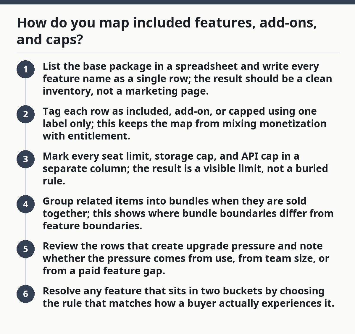
You map included features, paid add-ons, and usage caps by assigning each line item to one of those three buckets and then checking where the bundle boundaries break. The goal is to make each feature answer one question: is it part of the plan, sold separately, or limited by use?
- List the base package in a spreadsheet and write every feature name as a single row; the result should be a clean inventory, not a marketing page.
- Tag each row as included, add-on, or capped using one label only; this keeps the map from mixing monetization with entitlement.
- Mark every seat limit, storage cap, and API cap in a separate column; the result is a visible limit, not a buried rule.
- Group related items into bundles when they are sold together; this shows where bundle boundaries differ from feature boundaries.
- Review the rows that create upgrade pressure and note whether the pressure comes from use, from team size, or from a paid feature gap.
- Resolve any feature that sits in two buckets by choosing the rule that matches how a buyer actually experiences it.
The point is not to make the map pretty. The point is to remove ambiguity so a product manager can see, in one pass, whether a feature is part of the core offer or a monetized extra. Stripe’s usage-based billing guidance and Nielsen Norman Group’s pricing-page work both point in the same direction: the user should be able to see the rule without decoding it. See Stripe’s guidance on usage-based billing and Nielsen Norman Group’s pricing-page research.
The hardest rows are the mixed ones. A feature can be included up to a point, then capped, then sold as an add-on when the cap is exceeded. That pattern is common, but it is also where teams create the most confusion if they do not write the boundary in plain language. The boundary should show the rule in one line.
What belongs inside the base package?
The base package should hold the features that make the product usable without forcing an immediate upgrade. A buyer should be able to understand the core job of the software from that package alone. If the plan feels empty on day one, the packaging is too thin.
The right test is simple: if removing the feature makes the product fail its main job, the feature usually belongs in the base package. If removing it only slows expansion or adds convenience, it may belong in a paid add-on or a higher package. That does not mean every strong feature must be included, only that the boundary has to match the product’s first real use.
This is where many teams make a bad trade-off. They keep too much in the base package and then struggle to create upgrade pressure. Or they strip too much out and force a buyer to buy add-ons just to get started. The first choice weakens monetization; the second weakens adoption.
A useful rule is to keep one clear path to success in the base plan and reserve specialized power for add-ons. If the base plan needs a seat limit, storage cap, or API cap, write those limits in the map next to the feature, not in a separate note. That keeps the package honest and stops hidden constraints from becoming support noise later. It also makes the SaaS packaging boundary map easier to audit.
Where do paid add-ons and bundles fit?
Paid add-ons and bundles belong outside the base package, but they should still sit on the same map so the boundary is visible. An add-on is a single monetized extra; a bundle is a grouped set of extras sold together. If the map does not separate the two, the team will confuse packaging logic with product logic.
The practical difference matters. An add-on can be easy to explain but hard to price if it stands alone. A bundle can make the offer easier to buy, but it can also hide which feature is really driving the price. That is why bundle boundaries need their own line in the map.
Use the map to answer three questions: what is sold alone, what is sold only in a bundle, and what is never sold separately. That third bucket matters more than most teams think. If a feature is only available inside a bundle, the boundary is not about access alone; it is about how the buyer gets value in the first place.
The trade-off against the obvious alternative is clarity versus simplicity. A flatter package structure is easier to explain, but it leaves less room to monetize specialized demand. A bundle-heavy structure gives pricing more room, but it can make the plan harder to read. The map should show that cost clearly, not hide it.
How do you spot upgrade pressure without guessing?
You spot upgrade pressure by tracing where a buyer hits a cap, loses access, or needs a paid feature to keep going. Upgrade pressure is not a slogan; it is the point where the package stops matching the job. The map should show those points explicitly.
Look for three pressure sources. First, usage pressure from a seat limit, storage cap, or API cap. Second, feature pressure from a paid add-on that solves a common next step. Third, bundle pressure from a package that becomes cheaper or easier only after a buyer adds one more module.
The map should also show who feels the pressure. A small team may feel seat pressure first, while a product team may feel API pressure first, and an ops team may hit storage pressure first. That difference matters because the same cap can drive different upgrade paths for different buyers.
One common mistake is to treat every cap as a pricing trigger. That can create accidental friction in the base package. If the cap is too low, it does not guide expansion; it just blocks use. If you are unsure whether a cap should trigger an upgrade, consult a pricing or product specialist before changing it, and review the rule against the plan design. The better rule is to mark the cap, then decide whether it is a soft limit, a hard limit, or an add-on trigger.
What mistakes make the map useless?
The map becomes useless when it mixes wording, pricing, and policy in one line. A feature named one way in product, another way in billing, and a third way in sales usually means nobody owns the boundary. That confusion costs time because every team starts arguing from a different document.
Another mistake is hiding limits inside copy. If a seat limit or storage cap is buried in footnotes, the map will miss the real boundary and the upgrade pressure will look weaker than it is. The fix is plain language: one row, one rule, one location.
A third mistake is putting every edge case on the map. That turns a boundary map into a legal archive. Keep the main path visible and move exceptions into notes only when they change buyer behavior. A good map can be read in a few minutes; if it takes 30, it has already lost the point.
The last mistake is failing to name who the map is for. This version is for product, pricing, and growth teams deciding where included features end and monetized extras begin. It is not the right tool for building a full tier ladder or for designing sales handoff rules, which need their own page.
FAQ
How do you define package boundaries?
A package boundary is the line where a feature changes from part of the base offer to a paid extra or a capped resource. The easiest way to define it is to write the buyer job first, then mark which features are required to complete that job and which ones extend it. If the line is not obvious, the map should say so.
What belongs in a packaging boundary map?
A packaging boundary map should include included features, paid add-ons, and usage caps in one view. It should also show bundle boundaries and the specific limits that create upgrade pressure, such as seat limit, storage cap, and API cap. If a row does not affect entitlement or monetization, it usually does not belong there.
How do you separate included and paid features?
You separate included and paid features by asking whether the buyer gets the feature in the base package without extra payment. If the answer is yes, it is included; if the buyer needs an add-on or bundle to get it, it is paid. When a feature is included only up to a cap, write the cap next to it so the boundary stays visible.
Drafted with AI; not yet reviewed by a person.