How to Build a SaaS Launch Source Coverage Map for Owned, Earned, and In-Product Signals: A SaaS launch source coverage map is a simple inventory of where…
Last updated: November 18, 2026
A SaaS launch source coverage map is a simple inventory of where launch signals can appear, who owns each source, and how each signal gets tracked. It helps a team stop missing changes on the homepage, pricing page, changelog, help center, in-app prompts, and blog by separating owned, earned, and in-product signals before scoring begins.
Key takeaways
- Start with source coverage, not scoring. If the map is fuzzy, the score will be fuzzy too.
- Put each source in one bucket only. A pricing page update is owned; a user mention is earned; an in-app prompt is in-product.
- Mark who owns each source and how often it should be checked, or gaps will sit open for weeks.
- Treat launch signals as different from source reliability. Coverage answers “where can a signal appear?” not “how much do I trust it?”
- The map should show blind spots, like a help center article that can change before the homepage does.
What is a launch source coverage map?
A launch source coverage map is a list of launch signal sources grouped by channel, owner, and tracking rule. It is the planning sheet that tells a team which public signals belong in scope before any watchlist, alert, or score is built.
For a SaaS launch, the map usually starts with owned sources such as the homepage, pricing page, changelog, help center, blog, and in-app prompts. It also includes earned signals, such as media coverage, community posts, and partner mentions, but this page focuses on how to partition sources, not on judging which one is most reliable.
The point is to prevent two common failures. One is overlap, where the same signal appears in three places and gets counted three times. The other is omission, where a team tracks the blog but misses the pricing page, or watches press releases but not the in-app prompt that tells users the product changed.
This matters most when launch timing is short. A 24-hour delay can make a public update look invisible if the map only covers one source type. A good map names the source, the bucket, the owner, the check interval, and the rule for what counts as a launch signal.
Which source categories belong on the map?
The map should include owned, earned, and in-product sources, because each one captures a different part of a launch. Owned sources are the places the company controls, earned sources are public mentions it does not control, and in-product sources are signals that appear inside the app itself.
A clean first pass looks like this.
| Source category | Examples | What it usually tells you | Common gap |
|---|---|---|---|
| Owned | homepage, pricing page, changelog, help center, blog | official product change, positioning, feature scope | updates land in one page but not the rest |
| Earned | press, community posts, partner mentions, analyst notes | public reaction, outside coverage, secondary confirmation | team tracks the loudest channel and misses quieter ones |
| In-product | in-app prompts, onboarding prompts, release banners, settings copy | what users are told inside the product | the signal is visible only after login |
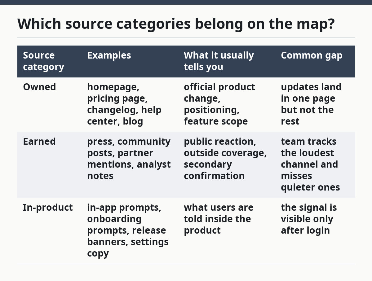
Owned sources are the easiest to scope because the company controls the text. That makes them ideal for a launch source coverage map. Earned sources need tighter tracking rules because they can multiply fast, and in-product sources need access to the app or screenshots because they are not always public.
The mistake is to mix categories in one bucket. A help center article and a social post can both mention a feature, but they do not belong in the same source line. If the map mixes them, the team will not know whether a gap sits in owned content, public reaction, or inside the product.
How do you build the map step by step?
Build the map by listing each source, assigning one category, and setting one tracking rule per line. That keeps the process usable in a spreadsheet, a project board, or a product-intelligence system.
-
Open a spreadsheet and list the source name. Start with homepage, pricing page, changelog, help center, blog, and in-app prompts in separate rows so nothing gets folded together.
-
Tag the source in one category. Mark each row as owned, earned, or in-product, and do not split a single row across more than one label.
-
Add the owner for the source. Put the team or role beside each row, such as product marketing, support, engineering, or communications, so you know who can change it.
-
Define the launch signal for the source. Write the exact change you care about, such as a new feature name on the pricing page, a new changelog entry, or a new in-app prompt.
-
Set the check cadence. Use a simple interval such as daily, weekly, or after a launch event, because the map is about coverage first and speed second.
-
Record the blind spot. Note what can hide the signal, such as content published only after login, a changelog buried below the fold, or a help center article that updates before the homepage.
-
Add the tracking rule. Say whether a change should trigger a review, a note, or a full launch alert, so the map feeds action instead of just storage.
This is the part that saves time later. If the map is done well, a launch review does not start with “where should I look?” It starts with the source list already sorted into clear lanes.
How should you partition owned, earned, and in-product signals?
The map should partition signals by control, visibility, and where the user sees them. Control decides who can change the source, visibility decides how easy it is to detect, and placement decides whether the signal sits outside or inside the product.
Owned signals belong in the same family even when they live on different pages. The homepage can frame the launch, the pricing page can define the package, the changelog can confirm the feature change, the help center can explain usage, and the blog can tell the story. Those pages often move on different schedules, so the map needs each one as a separate line.
Earned signals need a different rule. A public mention, a community post, or a partner note can confirm that a launch is being noticed, but it is still not the same as an official update. If the map treats earned sources as if they were owned, the team may think a rumor is a release note.
In-product signals are the most specific because they show what a current user is told at the moment of use. A release banner or an onboarding prompt may appear before a homepage update, or after it, depending on the team’s workflow. That is why in-product should be its own bucket rather than a note in the owned section.
The trade-off is simple. Broad buckets are easier to build, but narrow buckets are easier to trust. If the goal is launch coverage, narrow wins.
Where do coverage gaps usually hide?
Coverage gaps usually hide where the product and the public story are updated on different clocks. A homepage may be refreshed quickly, while a pricing page, changelog, or help center article lags behind for hours or days.
The most common gap is between the homepage and the pricing page. A launch can be announced on the homepage while the pricing page still reflects the old package. Another gap appears when the blog is updated but the changelog is not, which leaves the launch story visible but the product record incomplete.
Help center pages are another blind spot because they often live outside the marketing team’s daily view. A new article can reveal feature details before the launch team notices it. In-app prompts can also be missed because they sit behind login and may never appear in a public crawl.
A coverage gap is not only a missing source. It can also be a source with no owner or no cadence. If nobody owns the changelog row, the map has a hole even if the source exists. If a source has no check interval, it is present in theory and absent in practice.
The fix is to mark each row with a red flag when one of three things is missing: owner, cadence, or signal rule. That makes the gap visible before a launch does.
What tracking rules keep the map clean?
The map stays clean when each row has one source, one signal, and one action. That rule keeps a launch source coverage map from turning into a junk drawer of notes.
Use the same labels every time. For example, a homepage row can say “copy change,” a pricing page row can say “plan change,” a changelog row can say “new feature entry,” a help center row can say “new article or edited article,” and an in-app prompt row can say “new user-facing message.” Those labels are easy to scan and easy to hand off.
Do not let one row carry three meanings. If the changelog mentions a feature and the help center explains it, make two rows. That may look repetitive, but it stops the map from hiding where the signal first appeared.
A good rule also states what not to count. A small typo fix on the homepage is not the same as a launch note. A reordered help center paragraph is not the same as a new feature. If the rule is too loose, the map fills with noise; if it is too tight, it misses real change.
This is where a clear source rule matters more than a long list. A map with 8 clean rows is better than a map with 30 muddy ones.
What is the best way to review the map before launch?
The best way to review the map is to walk one launch through all listed sources and see where the story breaks. That review can happen in 10 minutes with the source list in front of you.
Start with the owned sources. Ask if the homepage, pricing page, changelog, help center, and blog would all show the launch in a way that matches the product story. Then move to in-product prompts and check whether the user-facing message matches the public message.
After that, scan the earned side. You are not ranking it here; you are checking whether the map has enough coverage to catch outside mentions without relying on a single channel. If the map only covers one public source, it is too thin for a launch that may spread across multiple places.
The review should end with one question: where would this launch be invisible? If the answer is “on the pricing page” or “inside the app,” the map still needs work. That is the point of the exercise, and it is the reason the map exists before scoring does.
For the signal formats used here, Google’s documentation on campaign URLs and event measurement is a useful reference point for how tracked changes are named and recorded:
https://support.google.com/analytics/answer/1033863?hl=en
https://support.google.com/analytics/answer/9304153?hl=en
What sources should a launch tracking system include?
A launch tracking system should include every source where an official or user-visible product change can appear. That usually means the homepage, pricing page, changelog, help center, blog, and in-app prompts, plus the earned channels you plan to watch.
The key is not to add every possible place on the internet. It is to include the places where a launch signal can actually appear for your product and audience. If a source cannot carry a meaningful launch change, leave it out.
How do you avoid missing launch signals across channels?
You avoid missing launch signals by giving each channel its own row, owner, and check rule. That stops a launch from hiding in a page that is related to the product but not watched closely enough.
The second step is to compare adjacent channels, not just the loudest one. A launch may show up first in the changelog, then the help center, then the homepage, or inside the product before any external mention appears. The map should make that path visible.
How do you decide which launch source is primary?
You decide the primary source by asking which channel is meant to carry the official launch story. The primary source is usually the one the team expects users, reporters, or customers to trust first.
That choice depends on the product and the launch type, not on a fixed rule. A homepage may be primary for broad messaging, while a changelog may be primary for feature detail, and an in-app prompt may be primary for current users.
Drafted with AI; not yet reviewed by a person.