How to Build a SaaS Navigation Labeling Guide for Menus, Footers, and Contextual Links: build a 3-part navigation labeling guide first, then apply it to…
Last updated: November 20, 2026
Quick answer: build a 3-part navigation labeling guide first, then apply it to menus, footers, and contextual links with the same rules. In this SaaS navigation labeling guide for menus, footers, and contextual links, one clear rule set helps your team name page labels, shorten them, and keep them consistent across site sections.
Key takeaways
- Start with labels people can scan in under a second, not with the team’s internal terms.
- Use one rule set for top menus, footers, and inline links, then allow small differences where the job changes.
- Keep labels short enough for cramped spaces, but specific enough that a user knows what happens next.
- Treat consistency as a wayfinding tool, not just a style preference; if the pattern affects usability, consider reviewing it with a UX professional. See Nielsen Norman Group on navigation labels and wayfinding: Navigation Design.
- The guide should tell editors what to do when a label is too long, too vague, or used in two places.
What should a navigation labeling guide do?
A navigation labeling guide should tell your team how to name menu labels, footer labels, and contextual links so users can move through the site without guessing. It is not the same as a site map or an internal linking plan; it is the writing rulebook for the words people see on the page.
For SaaS, that matters because the same product page can appear in a top menu, a footer, and a context block with three different label constraints. A top menu may only hold a few short items, while a footer can hold longer service names and legal pages. Contextual links sit inside body copy, so they need to read like part of a sentence, not like a button label from a 1990s UI.
The guide should cover three things at minimum: the label style, the decision rule, and the exception rule. The style says how labels are written. The decision rule says when to choose “Pricing” instead of “Plans,” or “Security” instead of “Trust.” The exception rule says what to do when a label must be longer than usual because the page name is unfamiliar or legally sensitive.
A useful guide also names who owns changes. If product marketing writes menu labels, but legal owns footer policy pages and content editors write contextual links, the guide needs to say who approves what. Without that, labels drift within a few weeks. For a broader content workflow, see the related content design guidelines and UX writing guide.
How do you build the guide?
Build the guide by auditing current labels, setting one naming rule, and then writing examples for each site section. The process works best as a simple workflow, not as a giant brand exercise.
- Audit your current navigation labels across the top menu, footer, and content blocks, and list each one in a spreadsheet.
- Group the labels by job, such as product, proof, support, company, and legal, so you can see where the same idea appears under different words.
- Mark every label that is too vague, too long, or repeated in two places with a different meaning.
- Choose a single naming rule for page labels, such as plain nouns first and action words only when the link sends users to a task.
- Write 2 or 3 approved label examples for each site section so editors can copy the pattern instead of inventing one.
- Set a review step for new labels so changes do not break wayfinding after one page update.
This is the point where many teams try to make every label clever. That usually fails. A clever label may sound smart in a meeting, but it can cost the user extra seconds on the page. For SaaS, those seconds matter because people are often scanning for product details, plans, docs, or support.
A good guide does not need a giant policy stack. It needs a repeatable set of choices that editors can apply in less than 5 minutes. If the team cannot tell at a glance whether a label belongs in the menu, the footer, or the body copy, the guide is too vague. Nielsen Norman Group notes that navigation should support quick recognition, not force recall.
How should menu labels work?
Menu labels should be short, plain, and stable because top navigation has the tightest space and the highest scanning pressure. The top menu usually has the fewest words to work with, so every label has to earn its place.
The safest pattern is usually one label for one major destination, with no hidden meaning. “Product,” “Pricing,” “Customers,” “Resources,” and “Support” are easy to scan because they match common expectations. A label like “Solutions” can still work, but only if the next click makes the path clear; otherwise it reads like a catch-all drawer.
The guide should also tell writers when not to pack the menu with page-level detail. If “Security Overview,” “Compliance,” and “Data Handling” all sit in the top bar, the menu turns into a wall of terms instead of a guide. Put those pages under a broader label and let the dropdown or secondary page do the sorting.
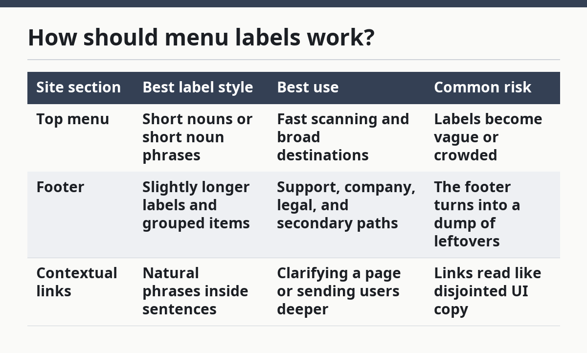
Use this comparison to set the rule for menu labels, footer labels, and contextual links:
| Site section | Best label style | Best use | Common risk |
|---|---|---|---|
| Top menu | Short nouns or short noun phrases | Fast scanning and broad destinations | Labels become vague or crowded |
| Footer | Slightly longer labels and grouped items | Support, company, legal, and secondary paths | The footer turns into a dump of leftovers |
| Contextual links | Natural phrases inside sentences | Clarifying a page or sending users deeper | Links read like disjointed UI copy |
Menu labels need the most restraint. If a label only works after a long explanation, it is probably not a menu label.
How should footer labels work?
Footer labels should be grouped by purpose and written with more room for detail than the top menu. The footer is where users go after they miss the main path, so the labels can be more explicit without feeling crowded.
This is where page labels such as “Security,” “Terms,” “Privacy,” “Contact,” and “About” often belong. They do not need the same marketing tone as menu labels because the footer serves recovery, reassurance, and reference. A user looking for a policy page does not want flair; they want the correct page name quickly.
The guide should separate footer labels into small groups, usually no more than a handful per group, so the structure is visible at a glance. If the footer is packed with 20 mixed items, the labels stop helping and start hiding each other. Grouping also helps when the same label appears elsewhere on the site. For example, “Support” in the header and “Support” in the footer can stay consistent if each one points to the same place.
One honest trade-off: footer labels can carry more detail than menu labels, but they should not become long sentences. A footer is still a scan surface, not a paragraph. If a label needs a clause to make sense, shorten the label and move the explanation to the page itself.
A footer guide also needs a rule for legal and trust pages. Even though this article is not about footer structure, the label itself still matters. If the team calls the same page “Legal,” “Policies,” and “Terms” in different places, users lose the thread. For more on footer patterns, see the related footer navigation patterns page.
How do contextual links differ from menu labels?
Contextual links should read like part of the sentence, while menu labels should read like destination names. That difference sounds small, but it changes the whole writing rule.
A menu label can be blunt because it stands alone. A contextual link sits inside body copy, so it has to sound natural and still tell the user where it goes. “Read the pricing page” and “See pricing” are different from a menu item named “Pricing.” The first two can live in a paragraph; the last one works best in navigation.
The guide should tell writers to match the link text to the surrounding copy. If the paragraph is about onboarding, a contextual link like “see the onboarding checklist” is clearer than “click here.” If the paragraph is about billing, a link like “compare plans” fits better than “pricing,” because it makes the action obvious.
Contextual links also need consistency across the site. If one article says “security details,” another says “security page,” and a third says “data protection,” the user has to decode three labels for the same destination type. That is a small problem on one page and a bigger one across 20 pages.
This is also where the guide should say what not to do. Do not turn every inline link into a mini menu label. Do not turn every menu label into a sentence fragment. The two jobs are related, but they are not the same. Good wayfinding depends on that difference.
What makes labels consistent across site sections?
Consistent labels use the same words for the same destination and the same level of detail for the same kind of page. That sounds basic, but it is the part teams break most often after the first draft.
A good rule is to keep one preferred label per page type and one backup label for edge cases. If the company uses “Pricing” in the menu, the footer should not switch to “Plans” unless there is a real reason. If the docs section uses “Help Center,” then “Support Center” should not appear in three other places as if it were a different thing.
Consistency also helps the reader form a map in their head. When labels repeat in the same form, users trust that the destination is stable. When labels drift, they stop using the navigation and start hunting for clues in the page copy, which is slower and more tiring.
A practical guide should include a small label list with approved forms and banned alternates. It does not need to be long. Even a short list can prevent confusion if it covers the most-used labels for product, pricing, support, docs, company, and legal pages. If the team wants to rename a label later, the guide should require that the same change be made in every site section at once.
That rule is strict on purpose. A half-updated label set can create a version of wayfinding where the user sees one word and the content team uses another.
What should the guide include as examples?
The guide should include before-and-after examples for at least 3 label problems: vague labels, bloated labels, and mismatched labels. Examples turn the rule into something an editor can use in 30 seconds.
For vague labels, show the fix. A label like “Solutions” may be too broad if the page is really about product use cases. A label like “Use Cases” is clearer when the destination is a list of applications. For bloated labels, show the cut. “Security and Compliance Information” may be too long for a top menu, while “Security” or “Compliance” can be split into two clearer paths. For mismatched labels, show how the same page should be named in the menu, footer, and contextual links without changing the core idea.
The guide should also note when a longer label is acceptable. A footer link can be more explicit than a menu item, and a contextual link can include a verb because it sits in a sentence. That is not inconsistency; that is context. The guide’s job is to define the boundary so writers do not guess.
If you want the guide to be used, keep the examples close to the pages the team actually edits. A generic example set about retail or media will not help a SaaS team decide between “Docs,” “Help,” and “Support.” Use the product’s own site sections and page labels so the rule feels real on the first pass. For a related example set, see navigation label examples.
FAQ
How do you choose navigation labels for SaaS content?
Choose labels by the user’s next click, not by the team’s internal name for the page. Short, plain labels work best in the top menu, while footer labels can carry a little more detail. If a label needs a long explanation to make sense, it is probably not ready for navigation.
What makes a good menu label?
A good menu label is short, clear, and easy to scan in less than a second. It should name a destination users already expect, such as product, pricing, support, or resources. If the label tries to sound clever, it usually becomes slower to read and harder to trust.
How do footer labels differ from top navigation labels?
Footer labels can be more explicit because the footer has more room and serves users who are looking for a specific page. Top navigation labels need tighter wording and stronger scan value. The same destination can keep the same core name, but the footer may allow a more descriptive version when needed.
Drafted with AI; not yet reviewed by a person.