How to Build a SaaS Internal Linking Map for Hubs, Spokes, and Conversion Paths: Build the internal linking map before you publish the next batch of…
Last updated: November 16, 2026
Build the internal linking map before you publish the next batch of posts. For SaaS, the map should show which hub page each spoke article supports, which money pages should receive links, and which anchor text should send readers from education to action without making the site feel forced.
Key takeaways
- An internal linking map is a planning sheet for link flow, not a list of random links added later.
- Start with hubs, spokes, money pages, navigation menu items, and breadcrumbs, then assign each page a job.
- The strongest path is usually educational page → hub page or spoke article → money page, with a clear anchor in between.
- Bad links cost crawl clarity and make conversion paths feel muddy, even when the content is strong.
- The map works best when it is tied to one cluster and one business goal at a time.
What is a SaaS internal linking map?
A SaaS internal linking map is a page-by-page plan for how one page should point to another. It shows the link hierarchy, the anchor text each page should use, and the route a reader should take from a hub page or spoke article toward a conversion path.
This is not the same as a topic list. A topic list says what to write. A linking map says where each page sits, which pages carry authority, and which pages should send readers to demo, pricing, trial, or comparison pages. Google Search Central’s guidance on crawlable links and site structure is a good baseline for this work, because links do two jobs at once: they help crawlers find pages and help readers move through the site. See Google’s Links and crawlable pages and SEO Starter Guide.
For SaaS, the map matters because the site is rarely just educational. A good blog post is useful only if it has a clean route to a money page. A bad map leaves the reader deep in content with no next step, or dumps them onto a pricing page too early.
Which pages belong on the map?
The map should include hub pages, spoke articles, money pages, the navigation menu, and breadcrumbs. Those five pieces cover most SaaS sites without turning the plan into a 20-tab spreadsheet.
A hub page is the central page for a topic, such as a pillar that collects related spokes. A spoke article covers one narrow question and should link back to the hub. Money pages are the pages that support conversion, such as pricing, demo, trial, product, comparison, or alternative pages. Navigation menu items usually give sitewide access to the main sections. Breadcrumbs show where a page sits in the hierarchy, and Schema.org’s BreadcrumbList is the standard markup model tied to that pattern.
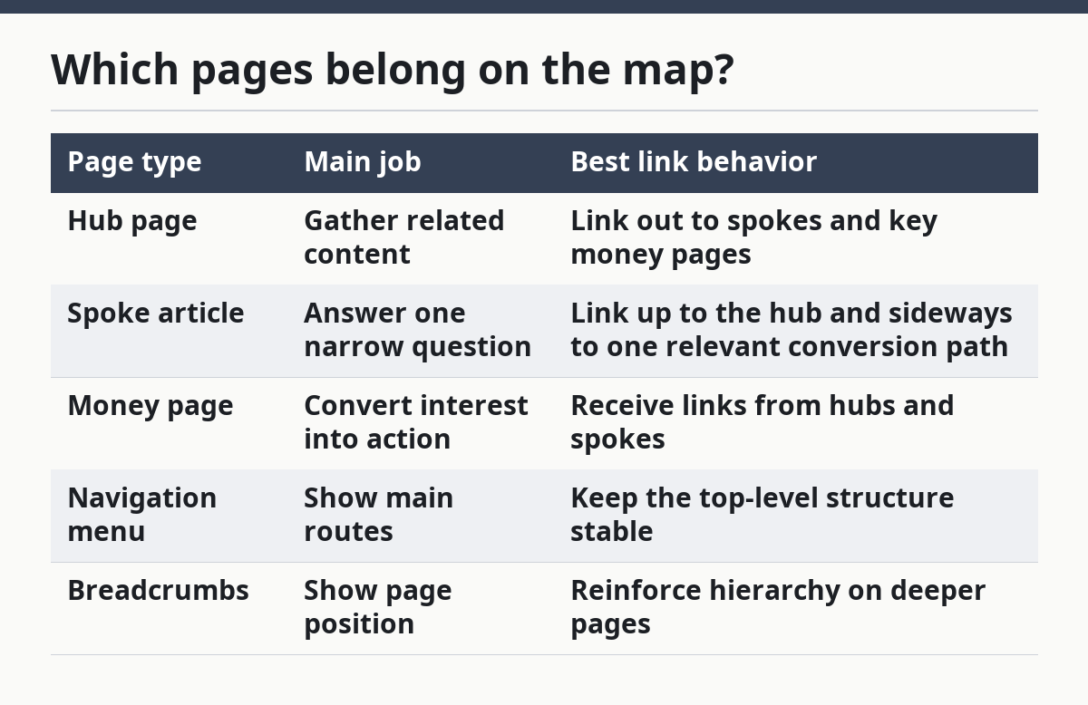
Here is the cleanest way to think about the role of each page type:
| Page type | Main job | Best link behavior |
|---|---|---|
| Hub page | Gather related content | Link out to spokes and key money pages |
| Spoke article | Answer one narrow question | Link up to the hub and sideways to one relevant conversion path |
| Money page | Convert interest into action | Receive links from hubs and spokes |
| Navigation menu | Show main routes | Keep the top-level structure stable |
| Breadcrumbs | Show page position | Reinforce hierarchy on deeper pages |
The trade-off is simple. A map that includes every possible link gets noisy fast. A map that only tracks blog links misses the pages that actually pay the bills. For SaaS, the money pages matter as much as the educational pages.
How do you build the map step by step?
You build the map by assigning one job to each page, then drawing the shortest useful route between related pages. The process works best in a spreadsheet or a plain table, not in a free-form doc that nobody updates.
- List the hub page for the topic cluster. Put the hub at the center because it is the page that should collect the broadest links and pass readers to narrower pages.
- List the spoke articles under that hub. Each spoke should answer one search intent, not five. If a page tries to cover too many questions, the link plan gets fuzzy.
- List the money pages that the cluster should support. For SaaS, that usually means pricing, product, demo, trial, comparison, or feature pages.
- Draw the primary route from education to action. A clean route is often hub page → spoke article → money page, or spoke article → hub page → money page.
- Assign anchor text to each planned link. Keep the anchor plain enough to tell the reader where the click goes, and specific enough to match the page topic.
- Add navigation menu and breadcrumb notes. These are not a replacement for in-content links, but they affect how the whole site reads.
- Check each page for one clear role. If a page is trying to be a hub, a spoke, and a conversion page at the same time, the map needs another pass.
A useful map usually includes just enough detail to stop guesswork. If you need a 10-minute meeting to explain the route, the map is probably too loose. If it needs a full day to read, it is probably too crowded.
How should link hierarchy work on a SaaS site?
Link hierarchy should move from broad pages to narrow pages and from educational pages to action pages. That means the hub page sits above the spokes, and the spokes point back up to the hub before they point to a money page.
The main rule is that not every page should link to every other page. A spoke about a narrow feature should not point to six different product pages just because they are available. That breaks topical focus and makes the site feel like a directory instead of a system.
A simple hierarchy usually looks like this:
- Top level: navigation menu
- Middle level: hub page
- Lower level: spoke article
- Action level: money page
This structure fits both crawl paths and reader paths. Search engines can move through the site more easily, and readers can move from one intent to the next without dead ends.
The honest downside is that strict hierarchy can feel too rigid on a large SaaS site. If a page has more than one valid next step, the map has to choose one primary path and one secondary path. That choice is better than scattering four equal links across the page.
What anchor text should the map plan?
The map should plan anchor text before publishing, because the link label tells both readers and crawlers what the target page is about. In practice, this means naming the destination clearly instead of hiding it behind vague words like “learn more.”
There are three useful anchor patterns for SaaS internal linking:
| Anchor type | Example style | Best use |
|---|---|---|
| Exact-topic anchor | Describes the page topic directly | Hubs, spokes, and product pages with a clear target |
| Partial-topic anchor | Mixes a topic term with a qualifier | When exact phrasing feels repetitive |
| Action anchor | Points to a next step | Demo, pricing, trial, or contact pages |
The trade-off is between clarity and repetition. Too many exact-match anchors can read stiff and repetitive. Too many vague anchors waste the link because the reader has to guess what is behind the click.
A solid map gives each target page one main anchor style and avoids changing that style every time the page gets linked. That makes internal links easier to manage across a large SaaS site, especially when multiple writers touch the same cluster over a 6-month stretch.
This is also where the map should note where not to link. If a spoke article already points to the hub and one money page, that may be enough. More links can dilute the route instead of helping it.
How do internal links support conversion paths?
Internal links support conversion paths by carrying readers from interest to intent in two or three clicks, not by dumping them straight onto a sales page. For SaaS, that usually means a reader starts on a how-to article, moves to a hub or comparison page, and then reaches a pricing or demo page.
The cleanest conversion path is the one that matches the reader’s stage. A beginner reading an educational post may not be ready for a pricing page. A comparison article, by contrast, can point to a product page or pricing page with much less friction.
A practical way to plan that route is to map one conversion page to each content cluster:
- Educational cluster → demo page
- Comparison cluster → pricing page
- Feature cluster → product page
- Problem-aware cluster → alternative page
That does not mean every article needs a hard sell. It means each page should have a next step that makes sense for the reader’s level of intent.
The drawback is obvious: if the path is too aggressive, the page feels commercial before it earns the click. If the path is too soft, the article gets traffic but no business value. The map should settle that trade-off before the page is written, not after.
What breaks an internal linking map?
An internal linking map breaks when it treats all links as equal. The most common failure is a site where every post links to the homepage, the same hub, and a random pricing page, no matter what the article covers.
A second failure is link sprawl. If one page points to 12 or 15 different destinations, the route becomes muddy and the page loses focus. Another failure is anchor drift, where the same page gets linked with three or four different phrases that do not match its topic well.
Watch for these mistakes:
- A spoke article with no link back to the hub
- A money page that never gets links from educational content
- A navigation menu that duplicates the job of in-content links
- Breadcrumbs that show hierarchy but do not support discovery
- Multiple pages fighting for the same conversion path
The fix is not more links. The fix is cleaner roles. One page should be the hub, one should be the spoke, and one should be the destination. When a page tries to do all three, the map is doing too much work.
This is also why the link map is part of site structure, not a post-publishing cleanup task. Once pages are live, the easiest links to add are often the wrong ones.
How does this differ from a topic cluster map?
A SaaS internal linking map is the execution layer, while a topic cluster map is the content plan above it. The cluster map decides what topics exist; the linking map decides how those pages connect and which pages should move readers toward conversion.
That difference matters because a site can have a decent cluster and still have weak links. A cluster can show that hub pages and spoke articles belong together, but it does not tell you whether the spoke should point to pricing, product, or a comparison page. The linking map does that work.
For a SaaS site, the best order is usually: build the topic cluster map, then build the internal linking map, then write the pages to match the routes. If that order gets reversed, the site often ends up with content that fits the topic but not the conversion path.
The limitation is clear: the map cannot fix thin content by itself. If the hub page is weak or the spoke article answers the wrong question, the links will only move readers through a bad structure faster.
How many internal links should a SaaS article have?
There is no fixed number that fits every SaaS article. The right count depends on the page’s role, the length of the content, and whether the page needs to point to a hub page, a spoke article, or a money page.
A better rule is to use only the links that earn their place. If a page has one clear hub link and one clear conversion link, that may be enough. If the page starts collecting extra links just to hit a target, the map is probably bloated.
What is the best anchor text for SaaS content?
The best anchor text is the one that says where the click goes in plain language. For SaaS, that usually means a short phrase that matches the destination topic instead of a vague label like “click here.”
The map should keep anchor text consistent across the same destination page, but not robotic. If the page is about pricing, product, or a feature, the anchor should sound like that page, not like a marketing slogan.
How do I link from informational pages to money pages?
Link from informational pages to money pages only when the destination matches the reader’s intent. A how-to article can point to a pricing page, demo page, or product page if the link feels like the natural next step.
The safest path is to move through a hub or comparison page first when the reader is still early in the journey. That gives the money page a better chance of earning the click instead of feeling like a jump cut.
Drafted with AI; not yet reviewed by a person.