
SaaS content architecture and site structure usually work best when the site is organized into 5 core page families, with one clear job for each page. For…
Last updated: November 16, 2026
Quick Answer: SaaS content architecture and site structure usually work best when the site is organized into 5 core page families, with one clear job for each page. For a software company, SaaS content architecture and site structure are the blueprint for how a software site groups pages, connects topics, and helps people find the right answer fast. In this guide to SaaS content architecture and site structure — The Complete Guide — product pages, use-case pages, comparison pages, docs, blog posts, and help content all need a clear place and a clear path.
Key takeaways
- A SaaS site should be built around jobs to be done, not around the company org chart.
- The homepage, product pages, use-case pages, and docs each serve different search intent.
- Clean structure is visible in the URL path, the navigation labels, and the internal links between pages.
- A good site map reduces duplicate content and keeps pages from competing with each other.
- This work is not for a site with only one page or a tiny brochure site with no real content depth.
What is SaaS content architecture?

SaaS content architecture is the plan for which pages exist, how they are grouped, and how they support each other. Site structure is the visible version of that plan: menu labels, folder paths, breadcrumbs, and the route a reader takes from one page to the next.
For a software company, the mistake is usually simple. The site grows one page at a time, then the blog, product pages, docs, and landing pages all start answering the same question in different places. That creates thin pages, messy navigation, and internal competition for the same query.
A useful way to think about it is this: the architecture decides what belongs on the site, and the structure decides where it lives. If the architecture is right, a reader can move from a broad topic to a narrow one in 2 or 3 clicks, not 7 or 8.
The clearest SaaS sites usually separate these page types:
- product pages for core features
- use-case pages for problems and outcomes
- industry pages for vertical fit
- comparison pages for alternatives
- docs for setup and usage
- blog posts for education and discovery
That separation matters because each page type serves a different intent. A comparison page should help a buyer decide; a docs page should help a user complete a task in under 10 minutes; a blog post should explain a concept or answer a research question. Put those jobs on the wrong page, and the page gets weaker.
What does good SaaS site structure look like?
Good SaaS site structure looks like a shallow, labeled tree with clear branches and no dead ends. The strongest sign is that every important page fits into one obvious place, and every page has a reason to exist beyond “we needed another landing page.”
The easiest way to see it is to compare a healthy structure with a messy one.
| Structure choice | Good version | Poor version | What the reader sees |
|---|---|---|---|
| Homepage path | Homepage → product → use case | Homepage → random blog post | A clear next step instead of a guess |
| Navigation labels | Product, Solutions, Pricing, Docs | Features, Resources, Stuff, Learn | Names that match the page purpose |
| URL folders | /product-pages/, /solution-pages/, /docs/, /compare-pages/ | /page123/, /blog2/, /misc/ | Topics grouped in a way search engines and people can read |
| Content depth | One page per main task or query family | Three pages for the same question | Less confusion and fewer duplicates |
| Internal linking | Related pages point to the next logical step | Links scattered only from the footer | Fast movement through the site |
The key here is the folder structure — notice how the folders tell the reader what kind of page to expect before the page opens. This is what separates a site that feels organized from one that feels pasted together.
A good rule is that the navigation should answer three questions in under 5 seconds: What does the product do? Who is it for? Where does someone go next? If the answer depends on hunting, the structure is too loose.
How do you plan the architecture step by step?

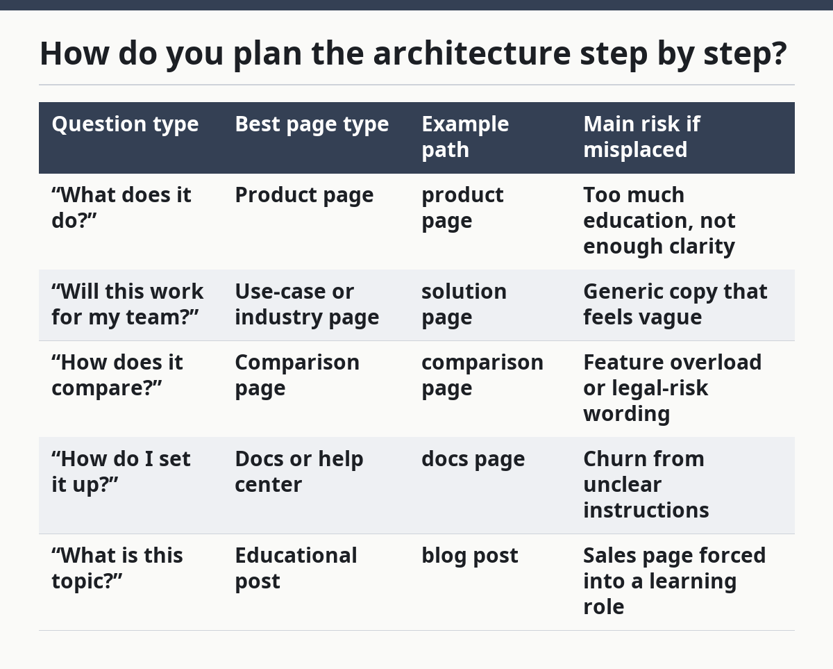
You plan the architecture by starting with the audience’s questions, then assigning each question to one page type, then mapping the internal links. The goal is not a big spreadsheet for its own sake; the goal is to stop overlap before pages get written.
- List the main questions people ask before, during, and after buying. Check that each question is phrased as a real search or task, not as an internal team label. Do not start with departments like Sales, Product, or Support.
- Sort each question by intent. Check whether the reader wants to learn, compare, choose, or do a task. Do not put a “how to” answer on a page meant to sell, and do not bury a decision page inside the blog.
- Assign one primary page type to each intent. Check that the same query family does not appear on 2 or 3 pages. Do not let a comparison page and a feature page fight over the same headline.
- Decide the top-level folders. Check that the site can be understood from a 4-item menu or a 5-item menu, not a long chain of labels. Do not create a folder for every tiny topic.
- Map the parent-child relationship. Check that each deeper page can be reached from a broader page in 2 clicks or fewer when possible. Do not leave orphan pages that only exist in the sitemap.
- Place internal links where the next question appears. Check that the link answers a natural follow-up, such as from a use-case page to a comparison page. Do not add links just to increase count.
- Review for overlap. Check that titles, H1s, and meta descriptions do not repeat the same angle across multiple pages. Do not publish two pages that promise the same result with different wording.
Before writing the first 10 pages, it is easier to do this work than after the site already has 100. Once pages exist, changing structure becomes slower because old links, redirects, and rankings start to matter.
A simple planning table helps keep the work honest.
| Question type | Best page type | Example path | Main risk if misplaced |
|---|---|---|---|
| “What does it do?” | Product page | product page | Too much education, not enough clarity |
| “Will this work for my team?” | Use-case or industry page | solution page | Generic copy that feels vague |
| “How does it compare?” | Comparison page | comparison page | Feature overload or legal-risk wording |
| “How do I set it up?” | Docs or help center | docs page | Churn from unclear instructions |
| “What is this topic?” | Educational post | blog post | Sales page forced into a learning role |
One hard truth: this work is not for a site that only needs a brochure and a contact form. If the product has no meaningful content surface, there is no architecture problem to solve.
What pages belong in the core SaaS structure?
The core SaaS structure usually includes 5 page families: homepage, product pages, solution pages, comparison pages, and docs. Those are the pages that carry most of the buying and adoption work, so they need the cleanest structure and the most obvious links.
The homepage should not try to do every job. It should act like a hub that routes people to the right branch in 1 scroll, not a wall of every feature the company has ever built. The product page should explain what the software does in plain language, then point to the next layer of detail.
The key visual clue is the hierarchy of headings. On a strong page, the H1 states the broad promise, the H2s break that promise into 3 to 6 parts, and the page ends with a next step that matches the reader’s intent. On a weak page, every heading sounds like a slogan.
The page family below is a useful baseline.
- Homepage: broad value, audience, main routes
- Product pages: feature detail and use
- Solutions pages: problems, roles, or industries
- Comparison pages: alternatives and trade-offs
- Docs/help: setup, usage, troubleshooting
The biggest mistake is to cram a docs answer into a marketing page or a sales pitch into a support article. Readers notice the mismatch fast, and so do search engines. A page that tries to be both ends up thin on both sides.
Here is the simplest way to check if a page belongs in the core structure: ask whether the page answers a repeated question that matters to revenue or retention. If the answer is yes, it deserves a stable home; if the answer is no, it probably belongs in a post or in the footer, not in the main nav.
How do content clusters fit into SaaS architecture?
Content clusters fit by giving the site a broad pillar page and a set of narrower pages that answer related questions. The pillar page covers the topic at a high level, and the cluster pages handle the edges, comparisons, examples, and implementation details.
This is where many SaaS sites go wrong. They publish one long guide, then scatter 12 short posts around it without a clear relationship. The result is a pile of content with no spine. A cluster works only when the pillar and the child pages are designed to support each other.
The visual test is simple. A good cluster has a clear hub page, a set of spokes, and consistent anchor text that tells the reader what each linked page is for. A bad cluster has random links, repeated headings, and no obvious path from broad education to a specific action.
A practical cluster around a SaaS topic might look like this:
- one pillar page that defines the main concept
- 3 to 5 support posts that answer sub-questions
- 1 comparison page for alternatives
- 1 decision page for buyers
- 1 implementation page for setup or workflow
The spacing between pages matters too. If two pages cover the same subtopic with only a small angle change, they should probably be merged. If one page is broad and one page is narrow, they can work together, as long as each one has a distinct search intent.
A clean cluster also helps with updating. When the product changes in 2025 or 2026, the pillar can stay stable while the child pages absorb new detail. That is much easier than rewriting a giant catch-all page every time the product shifts.
What should the URL and navigation system do?
The URL and navigation system should make the topic obvious before the page loads. A reader should be able to guess the page type from the path, and the site should not make anyone guess where they are in the hierarchy.
A good URL is short, lowercase, and grouped by purpose. A bad URL looks like an internal draft or a dumping ground. The same rule applies to the menu: labels should be plain enough that a new visitor understands them without company context.
The comparison below shows the difference.
| Element | Better choice | Worse choice | Why it matters |
|---|---|---|---|
| URL folder | /solutions/ | /resources/ | The first tells the reader what the page group does |
| Feature page path | /product/reporting/ | /feature-17/ | The first is readable in search and in links |
| Comparison path | /compare/competitor/ | /vs/competitor/old-page/ | The first keeps comparison pages in one place |
| Docs path | /docs/api/ | /help-center/article-224/ | The first signals a stable knowledge base |
The best navigation systems do not try to show every page. They show the 4 or 5 routes that matter most, then use breadcrumbs, footer links, and on-page links for the rest. That keeps the top nav light and keeps the site from feeling crowded on mobile.
This is also where standards matter. The Google Search Central SEO Starter Guide is a useful reminder that structure, internal links, and clear page purpose help both users and search engines. The W3C page structure guidance is useful for the same reason: clear headings and landmarks help people read the page faster.
What is the most common mistake?
The most common mistake is building pages around the company chart instead of the buyer journey. That produces menus like Product, Platform, Company, and News, while the actual questions people search for sit 3 layers deep or not at all.
Another frequent mistake is making one page do the work of four. A feature page that also tries to compare competitors, explain the category, teach the setup, and handle objections will usually read like a compromise. It has too much to say and too little space to say it well.
A safer way to spot this problem is to look for repetition. If the same 2 sentences appear on the homepage, the feature page, and the blog, the architecture is too loose. If the same question appears under 2 different H2s on 2 different pages, the structure is duplicating itself.
Here are the trade-offs that matter most.
| Choice | Good for | Cost | When it is wrong |
|---|---|---|---|
| Broad homepage with many links | New visitors who need routes fast | Can feel busy | When the product is simple and the page becomes cluttered |
| Deep cluster posts | Complex topics and SEO coverage | More planning and upkeep | When the team cannot maintain page quality over time |
| Flat site with few folders | Tiny sites with limited content | Harder to scale | When the site must cover many intents |
| Highly segmented structure | Large SaaS with many audiences | More page management | When the content team cannot prevent overlap |
The honest limit is that not every SaaS needs a deep structure. A small product with one core use case may do better with a lean set of pages and fewer branches. A large platform with several audiences usually needs the opposite: more structure, more page types, and tighter rules about what each page is allowed to do.
How do you know the structure is working?
The structure is working when people can find the next page without backtracking through the menu. In practice, that shows up as clear page paths, fewer duplicate topics, and pages that each have one main job.
A quick audit can be done in 6 checks:
- Open the homepage and count the main routes. Check that the routes are labeled by purpose, not by internal jargon. Do not hide core pages behind a catch-all “More” label.
- Open 3 product or solution pages. Check that each one has a distinct angle and a distinct next step. Do not let all 3 end with the same generic CTA.
- Open 3 posts in the same topic family. Check that each post answers a different sub-question. Do not let title tags and H1s say nearly the same thing.
- Open the docs. Check that setup, usage, and troubleshooting are separated well enough to scan in under 30 seconds. Do not bury task steps inside marketing copy.
- Trace 1 internal link path from broad to narrow. Check that the path makes sense in 2 or 3 clicks. Do not force a reader through unrelated pages to get to the answer.
- Check for orphan pages. Check that every important page can be reached from the main site, not just from the XML sitemap. Do not leave key pages isolated from the navigation.
If the structure is healthy, the pages feel calmer. The headings are cleaner, the links are more purposeful, and the reader does not have to guess where to go next. That is the real test, more than any diagram on a whiteboard.
FAQ
How deep should a SaaS site structure be?
A SaaS site structure should be as deep as the content needs, not deeper. For many sites, that means a homepage, a few top-level branches, and child pages underneath those branches. If a reader needs more than 3 or 4 clicks to reach an important page, the structure is probably too deep or the page is in the wrong place.
Should product pages and blog posts live in the same section?
Product pages and blog posts should usually live in different sections because they serve different intent. Product pages help someone evaluate the software, while blog posts help someone learn or compare. Keeping them separate makes it easier to write better headings, cleaner URLs, and clearer internal links.
What is the biggest sign of bad SaaS architecture?
The biggest sign of bad SaaS architecture is repeated content with different page names. If 2 pages answer the same question, or if the navigation uses labels that no outsider would type, the structure needs work. Another clear sign is when the homepage sends visitors in circles instead of toward a next step.
Do small SaaS companies need a content architecture plan?
Yes, even a small SaaS company needs a simple plan. A 10-page site can still confuse readers if pages overlap or if the menu is vague. The plan does not need to be long; it just needs to define page purpose, folder names, and the main links between pages.
What should be fixed first: URLs, navigation, or page content?
Page content usually comes first, then navigation, then URLs if the structure is already causing confusion. If the page has the wrong job, a clean URL will not save it. If the page is good but the paths and labels are messy, the site still feels hard to use.
Drafted with AI; not yet reviewed by a person.