How to Build a SaaS Pricing Page QA Checklist for Copy, Calculators, and Mobile Layouts: use a 6-step SaaS Pricing Page QA Checklist to catch copy…
Last updated: November 18, 2026
Quick answer: use a 6-step SaaS Pricing Page QA Checklist to catch copy, calculator, layout, cta, and checkout issues before publish. A good SaaS Pricing Page QA Checklist catches copy mistakes, broken calculator logic, and mobile layout issues before a visitor does. It should cover the pricing page, the mobile browser, the desktop browser, the checkout flow, and every cta that moves a buyer forward.
Key takeaways
- Check the page as a buyer would: plan copy, calculator math, currency display, and the path into checkout.
- Compare the page in at least 2 browser sizes, including one narrow mobile view and one desktop view.
- Treat calculator errors as conversion bugs, not cosmetic bugs, because a wrong total can break trust; if the pricing or tax logic is complex, consult a qualified professional and verify the implementation against the pricing rules. See W3C WCAG guidance and Nielsen Norman Group on error prevention.
- Keep one checklist that covers copy, logic, and layout, instead of three separate reviews that drift apart.
- Use clear pass/fail steps so the page can be reviewed in a few minutes before each publish.
What should be checked before publishing a pricing page?

A pricing page should be checked for copy accuracy, calculator logic, responsive layout, currency display, and the cta path before it goes live. That sounds broad, but the work becomes manageable when the checklist follows the page from top to bottom in the same order a buyer scans it. This article on the SaaS Pricing Page QA Checklist keeps that review focused on copy, calculators, and mobile layouts.
The cleanest way to do this is to review the page in 3 passes: content, behavior, and display. Content covers plan names, feature labels, billing terms, and the wording around any trial or add-on. Behavior covers calculator inputs, button states, totals, and the route into the checkout flow. Display covers how the page holds up in a desktop browser and a mobile browser, especially at narrow widths where columns collapse and labels wrap.
A simple checklist should also name the tools or views used for each pass. A page might look fine at 1440 px wide and still break at 375 px, which is a common phone width. The point is not to make the page perfect in the abstract. The point is to catch the kind of issue that changes the price a buyer thinks they will pay or the action they think the cta will take.
Use this page as the operational layer under the broader pricing page governance model and the checkout QA process. Governance sets the rules; this checklist catches the mistakes that slip through those rules.
How do I check pricing page copy?
Check pricing page copy by reading every price, label, and support line as if you were about to buy it today. Copy bugs are often small, but a single word can change what the user expects to happen after clicking a cta.
Start with plan names and feature bullets. If one plan says “team seats” and another says “users,” the language should be consistent enough that a buyer can compare them without guessing. Then check billing terms such as monthly, annual, billed upfront, per seat, or per workspace. A phrase that is clear to the team that wrote it can still be unclear to a first-time buyer on a phone screen.
Use a short manual pass for every line that contains a number or a unit. That includes currency symbols, seat counts, storage amounts, and trial lengths. A typo in “per month” versus “per year” is not just a style issue. It changes the price story.
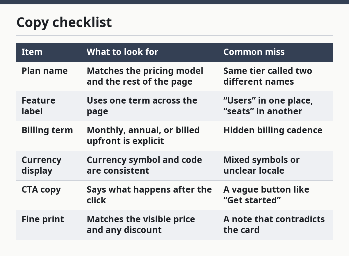
Copy checklist
| Item | What to look for | Common miss |
|---|---|---|
| Plan name | Matches the pricing model and the rest of the page | Same tier called two different names |
| Feature label | Uses one term across the page | “Users” in one place, “seats” in another |
| Billing term | Monthly, annual, or billed upfront is explicit | Hidden billing cadence |
| Currency display | Currency symbol and code are consistent | Mixed symbols or unclear locale |
| CTA copy | Says what happens after the click | A vague button like “Get started” |
| Fine print | Matches the visible price and any discount | A note that contradicts the card |
If the page includes a calculator, copy and logic need to match. A label that says “estimated total” should not sit above a field that actually locks the final price. When copy overpromises clarity, the calculator becomes harder to trust even if the math is correct.
How do I qa pricing calculators?

You qa pricing calculators by checking inputs, outputs, edge cases, and state changes in the calculator itself and then confirming the result carries through to checkout. A calculator that looks polished but drops a zero or ignores a selected seat count can do more damage than no calculator at all. For a SaaS Pricing Page QA Checklist, this is the part that usually deserves the most time.
The first pass is mechanical. Enter the smallest valid value, a middle value, and the largest allowed value for each field. If the calculator accepts a quantity field, try the stepper, direct typing, and clearing the field. If the page shows tiered billing, confirm that the total updates the moment the selection changes, not after a page refresh unless that delay is intentional and obvious.
The second pass is for mismatch. Check whether the total on the pricing page matches the number that appears on the next screen in the checkout flow. A buyer should not see one figure on the pricing page and a different one after clicking the cta. If there is a promotional note, confirm it affects the calculation in the same way on every device size, not only in the desktop browser.
The third pass is for edge cases. What happens if the field is left blank, set to zero, or pushed past the allowed range? The calculator should either stop the entry or explain the limit in plain language. Silent failure is usually the worst result because it can make the user think the page is broken.
Calculator QA steps
- Enter the minimum allowed value in every calculator field, such as 1 seat or 1 workspace, and confirm the total updates correctly.
- Enter a mid-range value, such as 5 or 10, and confirm the total uses the same pricing rule as the tier label.
- Enter the highest allowed value and make sure the page does not clip the total or hide a label on a 320 px mobile view.
- Clear each field, type a value manually, and confirm the calculator accepts the same result as the stepper.
- Click the cta and compare the total on the pricing page with the first price shown in the checkout flow.
- Try an invalid value, such as 0 or a blank field, and confirm the page blocks it or explains it clearly.
A calculator QA checklist is not complete unless it includes currencies. If a plan is sold in more than one currency, the symbol, code, and decimal formatting need to stay consistent on every state change. One page should not show $ in the card, USD in the summary, and a different format in checkout unless that switch is explained. For currency formatting, see Nielsen Norman Group’s pricing and trust guidance.
What breaks on mobile layouts?
Mobile layouts break when pricing cards, calculators, and ctas are built for wide screens first and compressed later. The most common problem is not a total collapse; it is a slow, messy squeeze that hides one critical line or pushes the cta below the fold.
Check the page at a narrow width first, then at a standard desktop width. A 375 px view will expose wrapping problems that 1440 px can hide. On mobile, look for cards that stack awkwardly, labels that wrap onto 3 lines, and totals that move so far down the page that the buyer loses the comparison point. If the calculator has side-by-side fields, ask whether those fields still read cleanly when the layout becomes one column.
Compare the two views below when you review a pricing page. The goal is not the same design in both places. The goal is the same meaning in both places.
| View | What should still be clear | Typical failure |
|---|---|---|
| Mobile browser at about 375 px | Plan name, price, billing term, cta, calculator total | Hidden labels or stacked text that changes meaning |
| Desktop browser at 1024 px or wider | Comparison across plans and calculator state | Overwide columns that spread too far apart |
| Small tablet view | One clear pricing decision without horizontal scroll | Cards that overflow the screen |
Pay attention to scrolling behavior too. A page can technically fit on mobile and still feel broken if the cta is trapped below a long feature list or if sticky elements cover the price. If the page uses sticky bars, test them with the keyboard open on mobile because that is where layout bugs often show up. See also mobile pricing page QA for the narrow-width pass.
One honest trade-off matters here: a dense comparison grid may work better on desktop, while a simpler stacked layout may work better on mobile. A page that tries to preserve every desktop comparison on a phone often becomes harder to read, not easier.
Which ctas and checkout checks matter most?
The cta and checkout flow matter most because they prove the page sends the buyer to the right place with the right price. A polished pricing page that breaks at the click is still a broken pricing page.
Start with the button text. The cta should describe the action, not just sound friendly. If the button opens checkout, the copy should make that obvious. If it starts a trial, the buyer should not have to guess whether payment is required first. Then check what happens after the click: same tab or new tab, login wall or no login wall, and whether the chosen plan, billing period, and currency carry over correctly.
The next check is visual state. Hover, focus, and disabled states should all make sense, even if the user never sees them all in one session. A disabled cta should say why it is disabled, not just look dim. A focused cta should remain visible in a keyboard pass, because buyers do not always use a pointer.
Do a final pass for mismatch between price and promise. If the pricing card says one thing and the checkout summary says another, the page loses trust immediately. Even a small difference, such as a missing billing period, can make the page feel uncertain. The checkout QA checklist should catch that before launch.
How do I run the checklist fast?
You run the checklist fast by using the same order every time and keeping the review to one pass per device. A practical pre-publish review can fit into 15 to 20 minutes if the steps are short and the pass/fail rules are clear.
Use this order: copy, calculator, mobile layout, desktop layout, cta, checkout flow. That sequence follows the buyer’s path and reduces backtracking. If the copy is wrong, there is no reason to spend time on the layout yet. If the calculator is wrong, do not waste time polishing the button shadow.
Mark each item as pass, fail, or needs review. Avoid vague notes like “looks okay.” A checklist with “okay” rows tends to survive a publish it should have blocked. If a page has multiple pricing cards, review the one most likely to convert and the one most likely to break; those are often not the same card.
This is where many generic checklists go wrong. They focus on design polish and forget state changes. They also split calculator QA from pricing copy QA, which is how a page ends up with a correct total and a wrong label, or the reverse. A single checklist should catch both in the same review, and the same pricing QA workflow can be reused on every release.
What are the most common pricing page errors?
The most common pricing page errors are copy drift, calculator mismatch, broken mobile wrapping, and a cta that sends the buyer to the wrong step. These errors cost trust because they make the price feel unstable, even when the underlying product is fine.
Copy drift happens when one section says annual billing and another says monthly, or when a plan is called by two names. That can make the buyer stop and re-check the page instead of clicking. Calculator mismatch costs even more because it changes the number the user expects to pay. A wrong total is not a small typo; it is a pricing bug.
Mobile wrapping errors are usually visual but not harmless. A cut-off unit, a clipped currency symbol, or a hidden footnote can change the meaning of the page. The fix is usually not a larger font. It is a layout decision that gives the price and the cta enough room at a narrow width.
The last common error is checkout drift. The page says one price, the checkout flow shows another, and the user has to guess which one is real. That gap often comes from a missing currency setting, a stale cache, or a plan mapping problem. A good checklist treats that as a publish blocker, not a future cleanup task, and if the billing rules are unclear, consult a qualified professional before release.
What should be checked before publishing a pricing page?
Check the copy, the calculator, the layout, the currency, and the cta path before publishing. The page should show the same plan names and totals in the pricing page and the checkout flow, and it should still read cleanly in a mobile browser and a desktop browser. See also the SaaS Pricing Page QA Checklist.
How do I qa pricing calculators?
Check the minimum value, a middle value, and the maximum allowed value for each field, then compare the total on the pricing page with the checkout flow. Also test blank fields, zero values, and manual typing, because those cases often expose logic bugs that a normal click path misses. For implementation issues, follow the calculator QA steps.
What are common pricing page layout errors?
Common layout errors include wrapped plan names, clipped price lines, hidden ctas, and cards that overflow on a narrow screen. A page can look fine at desktop width and still fail on mobile if the price, billing term, or calculator total gets pushed out of view.
Drafted with AI; not yet reviewed by a person.