How to Read a SaaS Footer for Legal Pages, Trust Signals, and Company Priority: a SaaS footer usually gives you 3 main clues in under 2 minutes—legal…
Last updated: November 16, 2026
Quick Answer: a SaaS footer usually gives you 3 main clues in under 2 minutes—legal pages, trust signals, and company priority.
Key Takeaways
- Privacy policy and terms of service usually matter most because they show data handling and service rules.
- True trust signals explain behavior; decorative badges do not.
- Footer links show priorities by revealing what visitors can reach in one click.
- A footer read breaks down when the links are too few, too many, or out of sync.
A SaaS footer tells you three things fast: which legal pages the company keeps current, which trust signals it wants you to notice, and which parts of the business it treats as priority. Read it as a map of risk, support, and corporate posture, not as decoration. This guide to How to Read a SaaS Footer for Legal Pages, Trust Signals, and Company Priority keeps the focus on public pages you can verify in 1 or 2 clicks.
Who should read a SaaS footer this way?
This applies to anyone checking a SaaS website footer for public clues about legal pages, trust signals, and company priority, especially when comparing 2 or 3 vendors from the outside. It assumes you can spot basic footer links and that you know the difference between a privacy policy, terms of service, security page, status page, and contact page.
Because of that, this is general information, not legal advice, and rules vary by jurisdiction. If you are trying to decide whether a footer satisfies a legal duty in your country, a qualified lawyer should review the facts and the local law. The related SaaS homepage and landing page analysis page sits in the same cluster, but this page stays focused on the footer.
How do I read a SaaS footer?
Read a SaaS footer in 7 passes: first for mandatory legal pages, then for trust pages, then for support routes, then for company pages, then for the order of links, then for what is missing, and finally for what repeats in the footer across the site.
- Scan the footer for a privacy policy, terms of service, security page, status page, and contact page; verify that each one opens cleanly in 1 click, and treat broken or buried links as a warning sign. If you need a legal or compliance judgment, consult a professional and check current guidance from the FTC and the ICO.
- Count the legal links and note whether they are present as a set of 3, 4, or 5 pages; verify that the names are plain and specific, and treat vague labels like “Legal” with no subpages as a weak signal. If the question is legal compliance, consult a professional before relying on the footer alone.
- Check the privacy policy and terms of service for current-looking text, clear ownership details, and cross-links back to the product or company; verify that the pages look maintained, and treat stale formatting or missing ownership as a problem. If the pages affect legal decisions, consult a professional and compare them with the company’s current policies.
- Inspect the security page for concrete security language, such as access controls, data handling, or compliance references; verify that it is a real page and not a badge image only, and treat a single logo with no explanation as thin proof. If you are assessing risk, consult a professional and review the page against independent security documentation.
- Review the status page for live operational information rather than a marketing claim; verify that it reflects service health or incident updates, and treat a status page that is just a static promise as low value. If uptime matters to your decision, consult a professional and confirm the live status history directly.
- Compare the contact page and support links with the product promise; verify whether the route is email, form, help center, or chat, and treat missing support paths as a sign of low service maturity.
- Rank the non-legal links by placement and prominence; verify which 1 or 2 topics get first position in the footer, and treat repeated emphasis on blog, careers, or pricing as a clue to company priority.
- Test the footer on mobile, where a crowded stack of 8 or more links can hide key pages; verify that the important pages are still easy to reach, and treat a collapsed or cramped footer as harder to read, not harder to judge.
A good read is not about perfect legal drafting. It is about pattern recognition: a footer with 5 clear policy and support routes usually signals a more deliberate public posture than a footer with 1 vague “Legal” link and a dead end.
Which legal pages matter most?
The privacy policy and terms of service matter most because they show whether the company expects to handle personal data and define the rules for using the service. In most SaaS footers, those are the 2 pages a careful reader should check first.
The privacy policy should explain data collection, sharing, and user rights in the relevant jurisdiction. The terms of service should explain service rules, account use, liability limits, and dispute language. If the footer also links to a security page, that usually helps because security claims can be checked against a page that says how data is protected, while a badge alone can be decoration.
A status page is different from a security page. A status page is about uptime and incidents; a security page is about controls and safeguards. A contact page is not a legal page, but it matters because it shows how the company wants users to reach a human, and that can reveal whether support is handled by email, form, or help center.
For general legal and privacy structure, authoritative guidance from the FTC and the ICO is useful background: the FTC’s business guidance pages and the ICO’s privacy notice guidance both show how organizations are expected to communicate clearly about data and business practices. Those sources do not tell you how one specific SaaS footer should look, but they give you a standard for plain, complete disclosure.
What trust signals in a footer are real?
Real trust signals in a SaaS footer are pages that explain behavior, not badges that only decorate the page. A security page, a status page, a contact page, and a clear privacy policy carry more weight than a row of logos with no context.
A trust badge matters more when it leads somewhere useful. For example, if a footer says “Security” and opens a page with specific controls or policy language, that is more useful than an image that claims trust with no explanation. The same is true for “GDPR” or “SOC 2” style references: without a supporting page or a clear explanation, the signal is weaker because the reader cannot verify the claim from the footer alone.
One clue is whether the footer gives you a path to facts in 1 or 2 clicks. A footer that links to a status page and support page shows that the company expects users to ask about availability and service issues. A footer that only links to a blog and social profiles may still be fine, but it puts less weight on accountability and more on marketing.
How do footer links reveal company priorities?
Footer links reveal company priorities by showing what the company wants public visitors to reach in 1 extra click. If careers, pricing, or security sit near the top, that says the company wants those areas noticed first; if they are absent, that says something too.
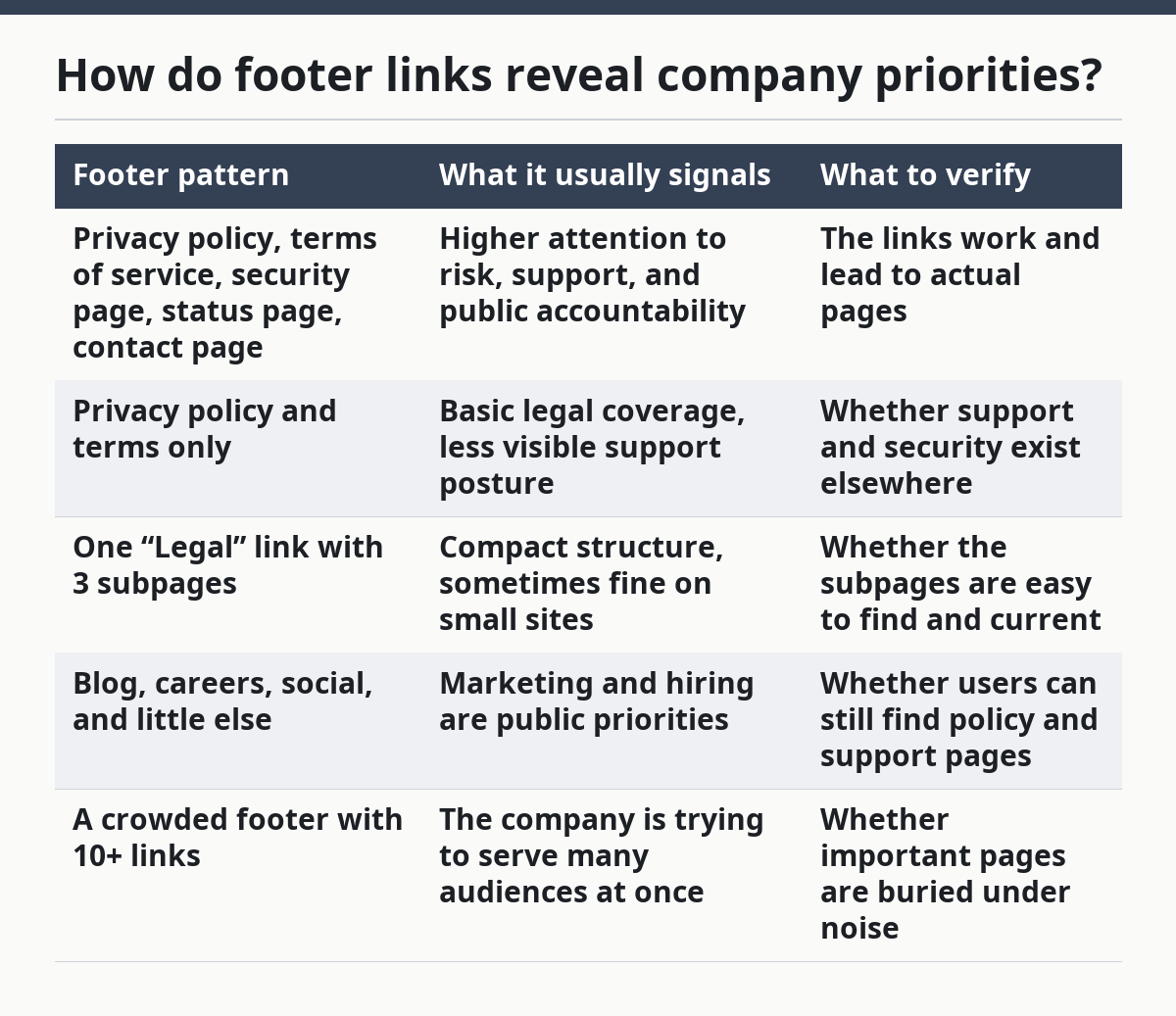
Here is a simple comparison of common footer patterns:
| Footer pattern | What it usually signals | What to verify |
|---|---|---|
| Privacy policy, terms of service, security page, status page, contact page | Higher attention to risk, support, and public accountability | The links work and lead to actual pages |
| Privacy policy and terms only | Basic legal coverage, less visible support posture | Whether support and security exist elsewhere |
| One “Legal” link with 3 subpages | Compact structure, sometimes fine on small sites | Whether the subpages are easy to find and current |
| Blog, careers, social, and little else | Marketing and hiring are public priorities | Whether users can still find policy and support pages |
| A crowded footer with 10+ links | The company is trying to serve many audiences at once | Whether important pages are buried under noise |
The order matters as much as the count. A footer with “Contact” before “Blog” and “Security” before “Terms” suggests the company expects service and risk questions to come first. A footer that places only marketing links high in the stack may still be legitimate, but it puts less visible weight on operational trust.
When does the standard read stop working?
The standard read stops working when the footer is too sparse, too crowded, or too disconnected from the rest of the site. In those cases, the footer alone cannot support a strong judgment, and the safer move is to treat it as incomplete evidence.
No privacy policy or terms of service: this means the footer is missing core legal pages — treat the site as underdocumented and do not assume the company is ready for careful scrutiny.
No contact page or support path: this means users may have no obvious way to reach a person — treat the support posture as weak and look for a help center or other support route elsewhere on the site.
No security page, but strong security claims elsewhere: this means the footer does not back up claims with a dedicated page — treat the claim as harder to verify and look for a separate security or trust page.
A status page that never changes: this means the page may be symbolic rather than operational — treat it as low-value evidence unless it shows current incidents or service history.
A footer that changes by region or product line: this means the legal and support structure is not uniform — treat the site as jurisdiction-sensitive and check the right version, especially if the service is offered across borders.
When the footer is thin, the better next step is to compare it with the privacy policy, terms of service, and security page directly. The footer is the index, not the whole file.
What mistakes do people make?
People usually make 4 mistakes when they read a SaaS footer, and each one costs them useful signal. The fix is to read the footer as a set of linked pages, not as a list of pretty words.
First, they treat any badge as proof. That is a mistake because a badge image without a supporting page gives you little more than branding. The correct alternative is to open the linked page and see whether the company explains the claim in plain language.
Second, they read only the privacy policy and skip the terms of service. That misses how the company frames user conduct, account use, and limits on liability. The correct alternative is to read both pages together because they answer different questions.
Third, they ignore support links because they seem non-legal. That misses one of the best clues about company maturity. The correct alternative is to note whether the company offers email, form, help center, or status page access.
Fourth, they assume all footers are built the same. That fails when a small SaaS has a compact footer of 3 links and a larger one has 12. The correct alternative is to judge structure against site size and public complexity, not against one fixed template.
Fifth, they confuse absence with proof. A missing security page does not prove weak security, and a visible status page does not prove strong uptime. The correct alternative is to treat the footer as a public signal, not as a complete audit.
What should a careful reader conclude?
A careful reader should conclude that a SaaS footer is a compact signal of legal hygiene, support maturity, and public priorities, but not a final verdict. The strongest footers tend to make the 5 core routes easy to find: privacy policy, terms of service, security page, status page, and contact page.
The right question is not “Does the footer look nice?” It is “Does the footer make the company easier to verify?” If it does, the footer is doing useful work. If it hides the important pages behind vague labels or leaves them out entirely, the site is asking the reader to trust without much structure.
For more on how footer signals fit into the larger page set, the hub on SaaS homepage and landing page analysis gives the wider frame.
What can I learn from a SaaS footer?
A SaaS footer can tell you which legal pages the company publishes, how easy support is to reach, and which topics the company treats as public priorities. It is a quick read, usually under 2 minutes, and it works best when you compare the footer with the privacy policy, terms of service, security page, status page, and contact page.
How do footer links reveal company priorities?
Footer links reveal company priorities by order, prominence, and repetition. If security and contact are easy to find, the company is signaling accountability; if blog, careers, and social links dominate, the company is signaling a stronger marketing or hiring focus. The key is what gets the first 1 or 2 positions, not just what appears somewhere in the list.
What trust signals belong in a SaaS footer?
The most useful trust signals in a SaaS footer are pages that explain how the service handles data, incidents, and support. A privacy policy, terms of service, security page, status page, and contact page are more useful than badges alone because they lead to text you can check.
Drafted with AI; not yet reviewed by a person.