SaaS homepage and landing page analysis — The Complete Guide: use a 4-part check for the SaaS homepage and landing page analysis—clarity, fit, proof, and…
Last updated: November 16, 2026
Quick answer: use a 4-part check for the SaaS homepage and landing page analysis—clarity, fit, proof, and friction. This guide shows how to read a SaaS homepage and a landing page, what each page is for, and which one should get your attention first. In the context of the SaaS homepage and landing page analysis, the main question is whether a page is orienting a visitor or converting one. If a site has one page that must explain the product and another that must convert a specific visitor, this article helps you tell the difference and judge both with the right lens.
Key takeaways
- A SaaS homepage and a landing page do different jobs, so the same critique does not fit both.
- The homepage should explain the product, the customer, and the trust signals fast; the landing page should match one promise and one action.
- Most weak pages fail for boring reasons: unclear headline, weak proof, too many links, or a mismatch between promise and content.
- The right verdict depends on whether the page needs broad orientation, focused conversion, or both.
- Good analysis looks at message fit, proof, friction, and the next step, not just color, layout, or copy polish.
What is this guide for?
This guide is for reading one SaaS page and deciding what it is doing well, what it is missing, and what should happen next. It is not a generic SEO essay; it is a practical way to judge a homepage against a landing page when the real question is where the visitor should go and why. In the SaaS homepage and landing page analysis, the goal is to separate orientation from conversion.
A homepage is the front door. A landing page is a narrower room with one job. That difference matters because a homepage usually has to answer several questions at once, while a landing page should remove most of them and push one action. If the page is trying to do both jobs in the same space, the analysis has to call that out.
However, the safest starting point is the visitor’s task. For SaaS, that task is usually one of three things: understand what the software does, decide whether it fits a workflow, or take the next step such as booking a demo, starting a trial, or reading more. A page that serves the wrong task may still look polished and still fail.
The standards behind this guide are plain. Use public UX guidance from Nielsen Norman Group on homepage structure and W3C guidance on accessibility, including WCAG 2.2 AA, as a floor, not a ceiling. For search-facing content, Google Search Central’s guidance on helpful content is also relevant, because a SaaS page that confuses users usually confuses search engines too. See Nielsen Norman Group, W3C WCAG 2.2, and Google Search Central.
What should a SaaS homepage analysis check?
A SaaS homepage analysis should check whether a stranger can tell what the product does, who it is for, and what to do next within one visit. That sounds simple, but most homepage failures come from a mismatch between the first screen and the rest of the page.
The first thing to inspect is the headline. It should name the category or the outcome, not hide behind slogans. A homepage for developer tooling, HR software, finance software, or marketing automation cannot afford a vague promise like “simplify your work.” The visitor needs a product-shaped statement, not a brand mood.
The second thing is the path. A homepage needs clear navigation, but not so much that the page turns into a maze. If the top of the page shows product, pricing, customers, resources, and a demo button, that is normal for a homepage; if it also shows six competing calls to action, the page starts to lose its center. A homepage is allowed to branch, but it still needs a main road.
The third thing is proof. For SaaS, proof usually means recognizable customer logos, short claims about results, product screenshots, integrations, security signals, and links to documentation or case studies. The analysis should check whether that proof answers the buying fear in front of the visitor. A startup selling into IT will need different proof than a tool for solo marketers.
The fourth thing is trust friction. A homepage should make the next click feel safe. That means clear company identity, clear pricing or at least a path to it, honest product scope, and no inflated claims. A homepage that promises everything to everyone tends to look busy and read as thin. The visitor may leave before reaching a demo form.
A good homepage analysis ends with one blunt question: does the page help the right people self-select? If it does, the homepage is doing its job. If it does not, the page is likely acting like a billboard when it should act like a guide.
How do you judge a SaaS landing page?
A SaaS landing page should be judged by message match, focus, and conversion friction. The key question is not “Is this page attractive?” It is “Does this page stay on one promise long enough to get one specific action?”
The headline should match the source that sent the visitor there. If the ad, email, social post, or partner link promised a webinar, trial, demo, checklist, or feature page, the landing page must echo that promise immediately. When the language changes too much, the visitor feels misrouted. That mismatch can reduce trust quickly.
The body copy should stay narrow. A landing page is not the place to explain every feature, every integration, every use case, and every company detail. It should give only the information needed to act. The analysis should check whether each section pushes toward the action or distracts from it. If a paragraph can be removed without hurting the conversion path, it may belong elsewhere.
The form or CTA deserves close attention. A short form can reduce friction, but only if it still collects the data the sales team or product flow truly needs. A long form can be justified if the lead is valuable and the next step is complex. The analysis should ask whether the page asks for too much too soon, or too little to qualify the lead. That trade-off depends on the product’s sale motion and not on taste.
The best landing pages also show one clear outcome. That outcome may be a trial, a booked call, a download, or a signup. When a page presents several equal-weight actions, it weakens the decision. The visitor starts comparing options instead of acting.
A landing page analysis should end with a hard check: can a first-time visitor explain the page in one sentence after five seconds? If the answer is no, the page is too noisy or too clever.
Where do homepage and landing page analysis differ most?
Homepage analysis and landing page analysis differ most in scope, and that difference changes every judgment. The homepage must orient many visitors; the landing page must persuade one type of visitor to do one thing.
The homepage gets judged on breadth. It needs to answer broad questions: what is this software, who is it for, why is it credible, and where can different visitor types go next? A landing page gets judged on depth within a narrow lane. It needs to answer: does this offer match my intent, and is the next step obvious?
That difference means the same element can be good on one page and bad on the other. A dense navigation bar can help a homepage because it gives pathways, but it can hurt a landing page because it adds exits. A long feature section can support a homepage by helping visitors self-qualify, but it can weaken a landing page if it delays the CTA. A testimonial block can strengthen both, but only if it is specific enough to the promise on the page.
The buying stage also changes the analysis. A homepage often serves people at the top and middle of the funnel, where the goal is orientation and trust. A landing page often serves lower-funnel traffic or a very specific campaign, where the goal is action. That is why the same SaaS brand can have a strong homepage and a weak landing page, or the reverse.
The right analysis also depends on traffic source. Organic visitors often need broader context. Paid visitors often need tighter message fit. Referral traffic may already carry trust. Email traffic may already know the company. The page cannot be judged in a vacuum, because the visitor’s starting point changes what counts as good.
Here is the honest side-by-side view.
| Criteria | Homepage | Landing Page | Winner for [condition] |
|---|---|---|---|
| Main job | Orient and qualify many visitor types | Convert one visitor type on one offer | Homepage for broad discovery |
| Navigation | Useful when it helps exploration | Risky if it creates exits | Homepage for multi-path browsing |
| Headline scope | Can be broader and brand-led | Must match the campaign promise closely | Landing page for campaign traffic |
| Proof needed | Broader trust signals, product scope, customers, integrations | Narrow proof tied to the offer and action | Depends on traffic source |
| CTA strategy | Multiple routes can be acceptable | One dominant action works best | Landing page for focused conversion |
| Content depth | More room for product, use cases, and trust | Less room; every block must earn its place | Homepage for early-stage visitors |
| Friction tolerance | Slightly higher because visitors can explore | Lower because the page must keep momentum | Homepage for research-heavy journeys |
| Success signal | Visitor knows what the product is and where to go next | Visitor completes the intended action | Depends on the page’s goal |
| Failure mode | Vague positioning or too many paths | Message mismatch or clutter | Landing page when campaign fit matters |
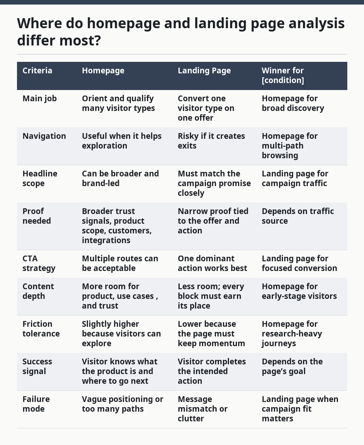
The table makes the real split obvious. A homepage wins when the user has not yet chosen a path. A landing page wins when the visitor has already been promised one thing and needs to finish that task without wandering.
What makes a SaaS homepage strong?
A strong SaaS homepage gives the right visitor three things fast: a clear category, a believable reason to stay, and one obvious next step. That combination matters more than visual polish, because a pretty page that hides the product still fails.
A strong headline does the most work. It should say what the software does in plain language and avoid foggy marketing language. The user should not have to decode the page to know whether it is for sales teams, finance teams, product teams, or developers. Clear category language beats cleverness almost every time.
The strongest homepages also show the product quickly. That can mean screenshots, interface images, short clips, or a simple visual model of the workflow. The point is not decoration. The point is to reduce the time between “What is this?” and “I see how it works.” A homepage that withholds the product too long often causes doubt.
Trust signals matter here more than many teams admit. If a SaaS company sells into a regulated field, security and compliance clues matter. If it sells to startups, integrations and speed may matter more. For enterprise customers, documentation, support, and procurement readiness can matter a great deal, so teams should consult sales, legal, and procurement stakeholders before deciding which proof to foreground. The analysis should not treat every trust signal as equal; it should match the proof to the likely objection, and sources such as Nielsen Norman Group and Gartner are often used as starting points for that review.
The weak side is that homepages often try to do too much. A homepage that stacks every feature, every persona, every testimonial, and every CTA may look complete but feel unfocused. The consequence is not just visual clutter. The consequence is uncertainty. A visitor who cannot tell the main path often leaves without taking one.
This is where many generic reviews get it wrong: they praise a homepage for “having everything” when the real problem is that everything fights for attention. A homepage should help a visitor choose, not exhaust them.
What makes a SaaS landing page strong?
A strong SaaS landing page keeps the promise narrow and the path short. It should feel like the ad, email, or referral link kept its word and then made the next step easy.
The best landing pages start with alignment. The headline repeats the offer in a clean way, and the supporting copy confirms the same thing without distraction. If the traffic source is about “book a demo,” the page should not feel like a product tour. If the offer is a trial, the page should not bury the signup behind brand storytelling.
A landing page is also where copy and form length matter most. A shorter form lowers friction, but the page still needs enough context to make the action feel safe. A longer form can work when the stakes are high, but only when the page gives a good reason to ask for those fields. The analysis should check whether the form respects the visitor’s time or merely collects data for the company.
Strong landing pages also remove competing exits. That does not mean hiding everything, but it does mean guarding the main action. Too many top-nav links, too many side paths, and too many secondary buttons can reduce completion. If the page is meant to convert, every extra exit has a cost.
The weakness of landing pages is obvious: they can become too narrow. A page built for one campaign can look useless to a different visitor. That is not a flaw if the page is doing its job, but it is a serious flaw if the site expects the page to carry organic traffic or broader product education. A landing page that over-optimizes for one action can become fragile.
This is where the honest trade-off shows up. A landing page can convert better because it removes clutter, but it can also explain less. If the product needs education before action, the page may need a stronger bridge section or a different destination.
What should be measured in the analysis?
The analysis should measure clarity, fit, proof, and friction, not just design taste. Those four ideas are enough to diagnose most SaaS homepage and landing page problems without pretending to run a lab.
Clarity asks whether the visitor can identify the product and the offer. Fit asks whether the message matches the traffic source and the visitor stage. Proof asks whether the page gives enough reason to trust the claim. Friction asks how hard it is to take the next step. If any one of those is weak, the page can still work, but it works less efficiently.
A useful review also checks page architecture. Look at the order of sections. The first screen should carry the main promise. The next screen should explain how the product works or why it matters. Later sections can add proof, detail, and objection handling. If the page starts with trivia, the analysis should say so plainly.
Accessibility belongs in the analysis too. WCAG 2.2 AA gives a practical baseline for readable text, keyboard access, form labels, and contrast. A SaaS page that looks polished but fails basic accessibility is not ready for a broad audience. That is not a nice-to-have issue; it affects who can use the page at all. See the WCAG 2.2 standard.
A solid analysis should also check the page against the source of traffic. Organic search visitors may need more explanation. Paid visitors may need tighter message matching. Direct visitors may tolerate more exploration. Email visitors may need less context and a faster route. The same page can be good for one channel and poor for another.
A generic article often stops at “make it simpler.” That advice is too vague to help. Simpler than what, for whom, and toward which action? The analysis only becomes useful when it answers those three questions.
When does the verdict flip?
The verdict flips when the page’s traffic, product, or buying motion changes the job the page must do. A homepage-first judgment is not always right, and a landing-page-first judgment is not always right.
One flip happens when the visitor arrives cold from paid traffic. In that case, the landing page often wins because it can mirror the exact promise of the ad and reduce the number of decisions. A homepage may still be useful as a backup path, but it is usually too broad for a focused campaign.
Another flip happens when the product is hard to understand in one sentence. In that case, the homepage often wins because it has room to explain the category, show the workflow, and add trust signals. A narrow landing page can feel too thin if the visitor still does not understand what is being sold.
A third flip happens when the product has several customer types. If a SaaS tool serves marketing, product, and operations at once, the homepage needs to route visitors to the right place. A campaign landing page may still work for one use case, but the homepage becomes the main sorting tool.
A fourth flip happens when the page has no clear next step. If the company cannot yet say whether the visitor should demo, trial, subscribe, or read more, then neither page is ready to optimize. A page without a decision path is a content problem, not just a conversion problem. In that case, the first fix is strategy, not copy.
The rule is simple: pick the page type that matches the visitor’s level of certainty. If the visitor needs orientation, the homepage should carry the load. If the visitor needs confirmation on a single offer, the landing page should.
Which page should get the stronger critique?
The landing page should get the stronger critique when the traffic is campaign-driven, because message mismatch and friction show up faster there. The homepage should get the stronger critique when the site depends on self-serve discovery, because weak positioning on the front door hurts every visitor. This is a judgment about where the business is trying to win, not about which page is prettier.
If the homepage is the first touch for most visitors, a vague headline and a cluttered hero are serious failures. If the landing page is the final step before conversion, a sloppy CTA or too many exits is a serious failure. The critique should follow the job.
That is why the same site can deserve two different notes. The homepage may need broader proof and stronger navigation. The landing page may need fewer links and sharper message fit. A good analysis does not flatten those differences into one score.
A strong critique also names what not to do. Do not bury the product under brand language. Do not pile on features before the visitor knows the category. Do not add more proof when the real issue is lack of clarity. Do not add more copy when the real issue is a weak offer. These mistakes are common, and they waste redesign cycles.
The most useful conclusion is usually not “make everything better.” It is “make the homepage more legible” or “make the landing page more specific.” That specificity saves time for design, copy, and growth teams.
What is the practical verdict?
Choose the homepage if the visitor needs to understand the product, compare paths, or self-select from more than one use case. Choose the landing page if the visitor arrives with a specific promise and needs one action with as little friction as possible. Neither page wins if the product message is unclear, the offer is undefined, or the team has not chosen the next step yet.
That verdict holds because the jobs are different. The homepage is for orientation and trust. The landing page is for alignment and conversion. A SaaS site that treats them as interchangeable usually gets both weaker.
For a reader trying to analyze a real site, the fastest move is to start with the page’s source of traffic and intended action. If the page has to educate broadly, analyze the homepage first. If the page has to convert narrowly, analyze the landing page first. If the page is trying to do both in one place, the analysis should call that out as the core problem.
The honest drawback of this approach is that it can feel blunt. Some teams want a single page to do everything. It usually cannot. The more the page has to explain, the less space it has to persuade. The more it has to persuade, the less room it has to explain.
FAQ
Is a SaaS homepage the same as a landing page?
No. A homepage is the main entry point for the whole site, while a landing page is built around one offer, one audience, or one action. The homepage usually has broader navigation and more context; the landing page should be tighter and more focused.
Which page matters more for SaaS conversions?
That depends on the traffic source and the buying stage. Paid campaigns and email offers often depend on landing pages, while organic discovery and brand trust often depend on the homepage. If the product is complex, the homepage may carry more of the education burden before any conversion happens.
What is the biggest mistake in SaaS page analysis?
The biggest mistake is judging both pages by the same standard. A homepage is not failing because it has more links, and a landing page is not failing because it has fewer. The real question is whether the page fits its job and the visitor’s intent.
Should a SaaS homepage include pricing?
It often should include a clear path to pricing, and sometimes pricing itself belongs on the homepage. The right choice depends on how much the product needs explanation before a visitor can judge value. If pricing is hidden without a reason, the page can feel evasive.
What should I check first when analyzing a page?
Check the headline, the main action, and the proof above the fold. Those three elements usually reveal whether the page is clear, focused, and credible. If those fail, the rest of the page usually has to work too hard.
Drafted with AI; not yet reviewed by a person.