How to Build a SaaS Price Architecture Map for Entry, Expansion, and Enterprise Tiers: a SaaS price architecture map usually works best with 3…
Last updated: November 17, 2026
Quick answer: a SaaS price architecture map usually works best with 3 layers—entry, expansion, and enterprise—because it shows 1 clear path from first purchase to larger use. A SaaS Price Architecture Map shows how your entry tiers, expansion plans, and enterprise tiers fit together so a buyer can move up the ladder without confusion. It is a practical way to spot gaps, overlaps, and dead ends in a pricing page before the market points them out. If the ladder is unclear, the plan hierarchy can feel random and the best-fit buyer may slip away.
Key takeaways
- A price architecture map is not a price sheet; it is a map of movement from first purchase to larger use.
- Start with 3 layers: entry, expansion, and enterprise.
- Each tier should have one clear job, one clear buyer, and one clear reason to move up.
- A weak ladder usually fails because the tiers overlap, not because the price is too high.
- The map is most useful when it shows what changes at the next step, not just what is included now.
What is a price architecture map?

A price architecture map is a one-page view of how pricing tiers connect across buyer maturity, from the first paid step to the largest contract shape. It is the tool that turns pricing into a ladder instead of a list.
The map should show 3 things at once: where a buyer starts, what triggers the next plan, and where the enterprise tier becomes the right fit. If those links are missing, the buyer sees isolated plans instead of a plan hierarchy. That usually leads to price anchoring fights, feature confusion, and slow upgrades.
A useful map is not the same as a pricing page audit or a feature comparison sheet. A pricing page audit asks how the page is read. A feature sheet compares limits and contract terms line by line. A price architecture map asks a different question: how do the plans ladder together over time?
This matters because SaaS buyers do not stay in one stage for long. A small team may begin in an entry tier, add seats or usage through an expansion plan, then move into an enterprise tier once control, support, or procurement matters more than speed; if the path is unclear, consult a pricing professional and review source material such as Stripe and ProfitWell. The map should show that path clearly in one view.
How do pricing tiers fit together?
Pricing tiers fit together when each one does a different job in the buyer journey and the step up makes sense in under 30 seconds. If a buyer cannot tell why the next plan exists, the tier ladder is broken.
The cleanest way to think about it is by motion, not by labels. Entry tiers are for first use. Expansion plans are for growing use. Enterprise tiers are for large, complex buying. That sounds simple, but many SaaS plans fail because two tiers serve the same job or because one tier jumps too far ahead.
A good ladder has visible pressure points. A buyer should see what changes at the next level: more users, more volume, more controls, more support, or a procurement-ready contract shape; if that step is important for pricing, consult a pricing or legal professional and review sources such as Stripe and ProfitWell. The exact mix depends on the product, but the change must be easy to explain.
Use a simple three-layer view:
| Layer | Main job | Common buyer signal | Risk if it is wrong |
|---|---|---|---|
| Entry tier | Help the buyer start | Small team, low commitment, simple need | Too much value gets given away |
| Expansion plan | Capture growth inside the account | More use, more seats, more workflows | The buyer outgrows the plan too fast |
| Enterprise tier | Fit complex buying | Security review, approvals, larger deployment | The plan feels vague or overbuilt |
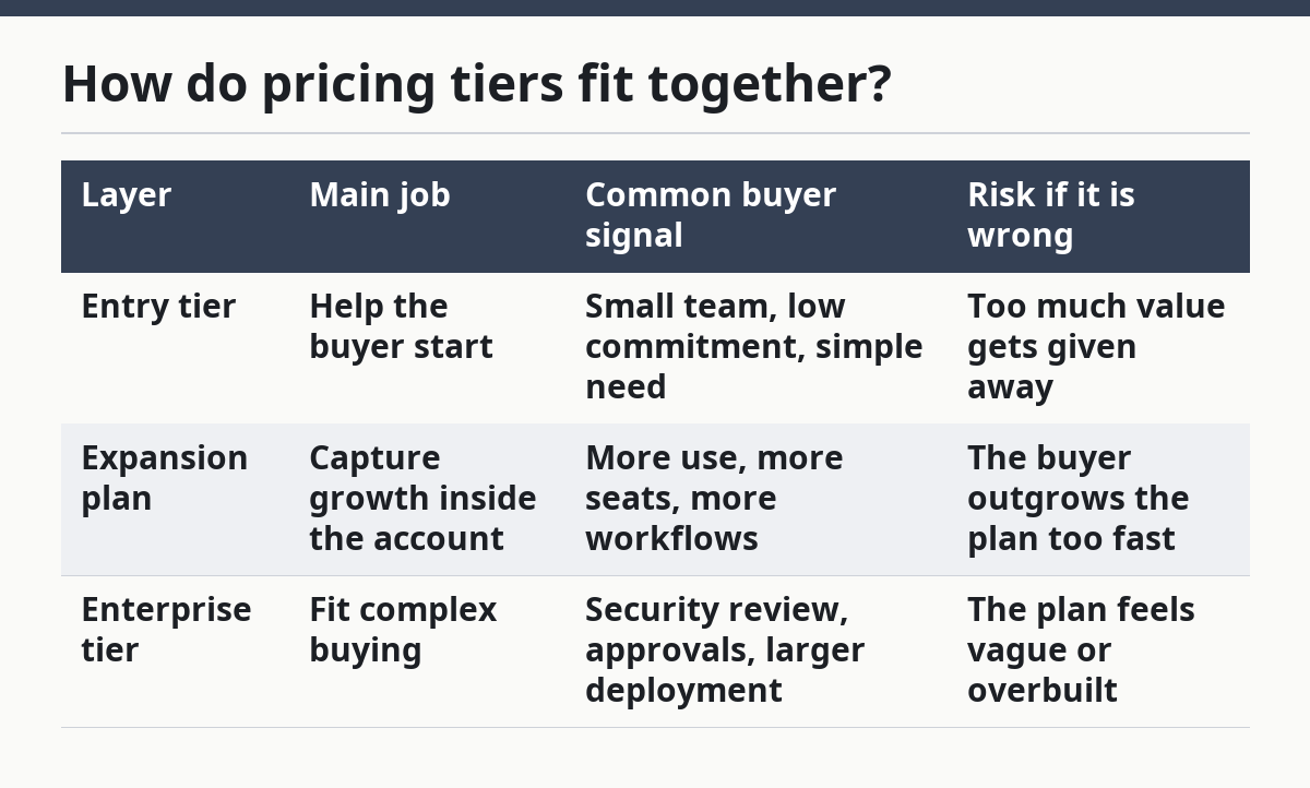
That table is the core of the map. It keeps the ladder readable without pretending every SaaS business should use the same model. A usage-heavy tool may push expansion through volume. A workflow tool may push it through seats or team size. A compliance-heavy product may push it through controls and process depth.
Build the map in 5 steps

Build the map in 5 steps by starting with the buyer journey, then placing each tier into the right rung of the ladder. The point is to make the path obvious, not to make every plan look impressive.
-
List the 3 buyer stages on paper: entry, expansion, enterprise.
Write one sentence under each stage about what the buyer is trying to do, so each tier has a job before it has a price. -
Map the trigger for movement in a simple 1-line note per tier.
Use the clearest signal you can name, such as more seats, more usage, more control, or procurement needs; if the trigger affects contract terms, consult a pricing professional and review sources such as Stripe and ProfitWell. -
Assign one primary value metric to each rung.
Keep the metric consistent enough to explain in 10 seconds, so the buyer knows what grows and why the bill changes. -
Place the guardrails beside each tier.
Add the limit, cap, or access rule that keeps the tier honest, because a ladder without guardrails invites confusion and margin loss. -
Review the map against the next larger plan.
Check whether the move from entry to expansion, and from expansion to enterprise, is clear in one glance; if it takes a meeting to explain, the map is not ready.
This is where most generic pricing advice goes wrong: it talks about price levels without showing movement. A price architecture map is about direction. It should let a product manager, marketer, or founder point to a rung and say, “This is where the buyer starts, this is where they grow, and this is where the contract changes shape.”
The map also helps expose a common mistake: two tiers that both look like “mid-market” without a real reason to exist. That usually creates a dead zone where neither plan is attractive. The fix is not always a price change; sometimes the fix is to move the boundary, rename the tier job, or change the trigger that opens the next step.
Where should entry tiers start?
Entry tiers should start where a buyer can get value fast without needing a long approval cycle or a heavy rollout. The right starting point is the first rung that feels safe, not the cheapest possible offer.
A strong entry tier usually does 3 things at once. It reduces friction, proves the product’s core value, and leaves room for growth. If the entry tier includes too much, the buyer never needs to move up. If it includes too little, the buyer never gets far enough to see value.
The map should show the entry tier as a doorway, not a destination. That means the tier needs a clear reason to exist even if it is not the most profitable plan. It also means the tier must not carry enterprise-style complexity such as custom controls, deep admin work, or contract-heavy buying steps. Those belong higher on the ladder.
A useful test is simple: can a first-time buyer explain why they chose the entry tier in one sentence? If the answer is “it was the only one that made sense,” the architecture is working. If the answer is “it seemed cheapest,” the map is too weak. Cheap is not a strategy unless it leads somewhere.
The trade-off is real. A stronger entry tier may slow early revenue because it gives away less. But it usually improves the quality of the upgrade path. That is the point of the map: to protect the path, not just the opening offer.
How do you design expansion plans?
Design expansion plans by tying growth to a single, visible change in buyer use. The best expansion plan makes the next step feel natural because the buyer has already outgrown the entry tier.
Expansion plans should answer one question: what changes when the buyer grows? That change can be more users, more usage, more teams, more data, more workflows, or more admin control. The map should pick one dominant motion and make the plan ladder reflect it.
Keep the expansion rung close enough to the entry tier that the jump feels earned, but far enough away that the buyer sees a reason to move. If the gap is tiny, the plans blur together. If the gap is huge, the buyer stalls. That is why a pricing architecture map matters more than a list of features; it shows distance between rungs, not just contents.
A simple way to build this part of the map is to mark 3 things for each expansion plan:
- the trigger that pushes the buyer up,
- the value gain they get at the next rung,
- the friction removed by moving.
That third point is easy to miss. Expansion is not only about more value. It is also about less hassle. A larger plan may reduce manual work, add support coverage, or bring a cleaner approval process. If the map ignores friction, it underestimates why buyers upgrade.
This section is where a weak pricing ladder often shows its cracks. If the expansion plan does not feel obviously better than the entry tier, the account may remain stuck. If it feels too close to enterprise, the buyer may hesitate. A good map keeps the middle rung alive.
What belongs in an enterprise tier?
An enterprise tier belongs where the buying process changes as much as the product does. The enterprise tier is for larger deals, more decision-makers, and more demands around control, support, and contract shape.
The biggest mistake is to treat enterprise as a bigger version of the same plan. It usually is not. Enterprise buying often brings extra review steps, more stakeholders, and more need for fit. The map should reflect that by showing different requirements, not just a longer list of features.
Enterprise tiers often sit on the top rung of the ladder for 3 reasons. First, the buyer needs more structure. Second, the deal usually involves more than one user group. Third, the seller needs room for custom terms or deployment work. If the map leaves those factors out, the enterprise tier looks like a fancy name instead of a real stage in the plan hierarchy.
That said, enterprise is not for every SaaS company. If the product has little variation in use, few deployment issues, and no clear reason for a larger buying motion, an enterprise tier can create noise. It may also pull attention away from the entry and expansion tiers that actually drive the business. In that case, the map should stay honest and narrow.
A good enterprise rung is specific about why it exists. It should be obvious what the buyer gets that the lower tiers cannot hold. If the answer is vague, the map is overbuilt.
What should I check before I publish the map?
Check the map for 4 failures before you publish it: overlap, dead ends, hidden jumps, and tier drift. Those failures make the ladder hard to buy from and hard to sell through.
Overlap happens when two tiers solve the same job. The cost is confusion, and the fix is to separate their role or remove one. Dead ends happen when a buyer reaches a tier with nowhere sensible to go. The cost is stalled growth, and the fix is a clearer expansion path.
Hidden jumps are harder to spot. They appear when the buyer must accept too much more complexity, commitment, or price at once. That cost is lost momentum, especially between entry and expansion. Tier drift is the slow creep where a plan starts serving the wrong buyer. The cost is a messy plan hierarchy, and the fix is to reassign the tier’s job.
A final check is practical: can the map explain the ladder in one minute? If not, the architecture is still too crowded. For a useful reference on pricing and packaging structure, the hub page on SaaS pricing and packaging strategy belongs nearby, but this page should stay focused on the map itself.
Use source reading to sharpen the map, not to replace judgment. Stripe’s pricing model material and ProfitWell’s pricing guidance are useful places to compare language and structure: Stripe and ProfitWell. The exact page you choose should be the one that matches the question you are answering.
What is a price architecture map?
A price architecture map is a visual plan for how SaaS tiers relate to each other. It shows where the buyer starts, how they move up, and where the enterprise tier fits.
How do pricing tiers fit together?
Pricing tiers fit together when each one serves a different buyer stage and the move upward has a clear trigger. If the tiers overlap or leave gaps, the ladder feels random instead of intentional.
How do you map an expansion path through SaaS tiers?
You map an expansion path by choosing the main growth trigger, such as users, usage, or controls, and placing it on the next rung. The path should show what changes, why the buyer upgrades, and what problem the higher tier removes.
Drafted with AI; not yet reviewed by a person.